Rebranding of Mangazeya development company
- Research
- Brand platform
- Global positioning slogan
- Brand identity
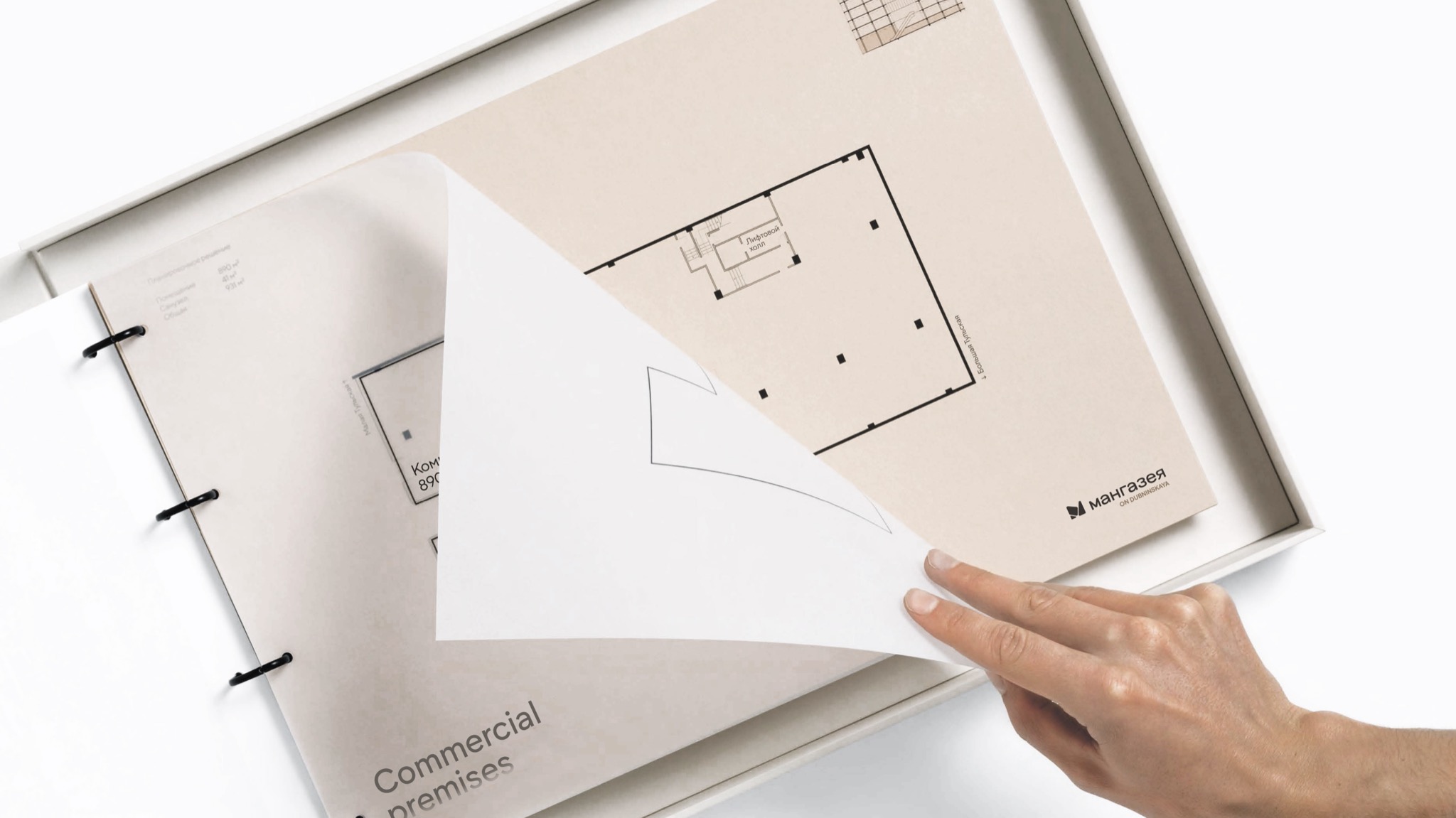
- Booklet
- Brand book/li>
- Communication strategy
Research
Mangazeya Development, part of the Mangazeya group of companies, approached us for rebranding. Our task was to create a flexible corporate identity that could be scaled to different divisions of the group. We collaborated with Exalter to design the brand's visual structure. We assumed that the developer operates in the comfort and business class segments. Another condition had to be met – that the client was likely to name new objects using the formula 'Mangazeya on [street name]'.
Another task was to create a new brand legend that conveyed comfort, distinct from the original one associated with gold mining. To grasp the key ideas, we conducted a thorough analysis of the company, market, competitors, and target audience. During our immersion into the company, we discovered that the legend of achievements in gold mining is not suitable for modern development. Our analysis revealed that Mangazeya is a reliable developer that prioritizes comfort and well-being.
We used the Psychea model to identify two main target audience segments, such as the Orlovs (utilitarian-demonstrative type) and the Lastochkins (demonstrative-utilitarian type). The Orlovs value the developer's reliability and the infrastructure's comfort, while the Lastochkins prioritize the project's aesthetics. Based on our communication with the client, we determined that the Orlovs are our target audience.
Legend of the brand
We developed a brand platform and verbal and visual communications based on data collected through in-depth interviews. The focus is on the reliability and stability of the developer, which are important criteria for the target audience.
The brand's new tagline uses the metaphor of honey as liquid gold to reflect ideas of comfort and orderliness. The metaphor is: Mangazeya Development is bees that make honey. We have combined multiple meanings in this text. Honey represents a sweet life, while the image of construction bees conveys order and reliability.


Key meanings and slogan
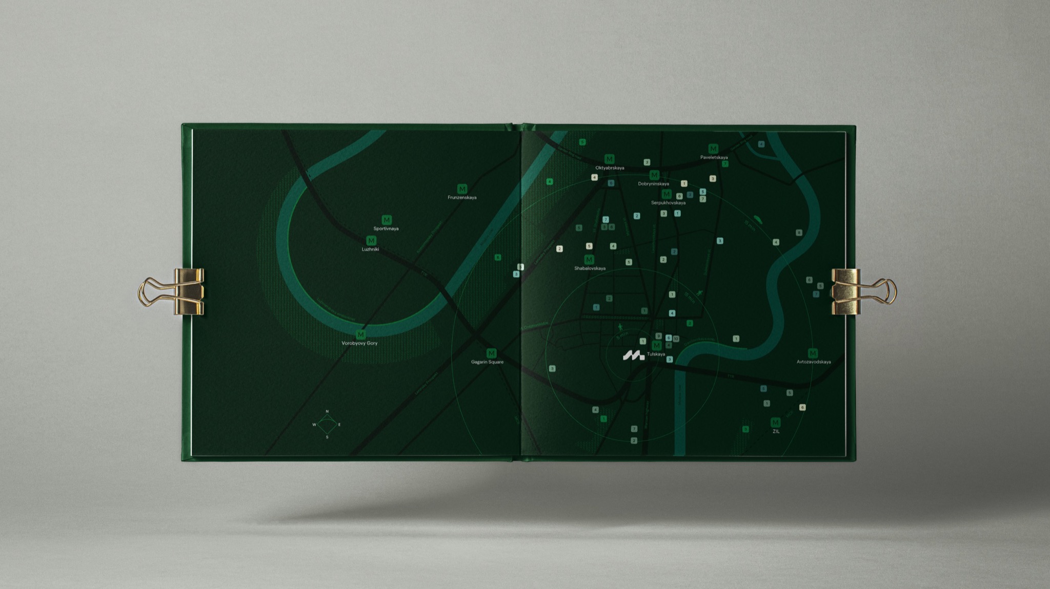
Additionally, we created a communication strategy and outlined the customer journey map. This included defining communication channels and key messages for broadcasting, based on the information we gathered from the audience analysis.
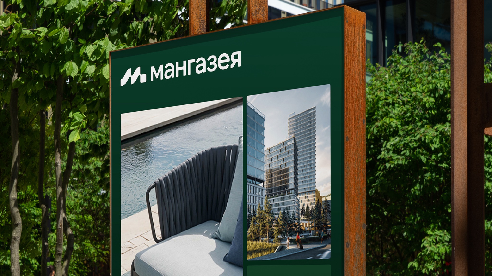
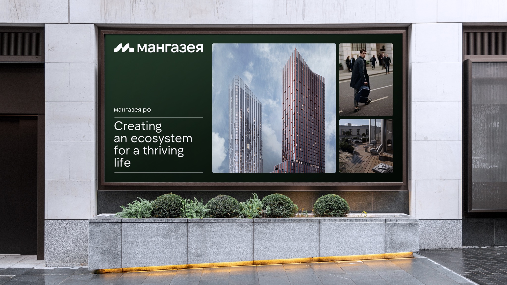
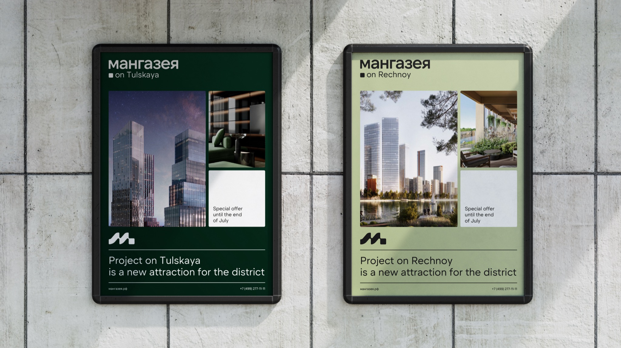
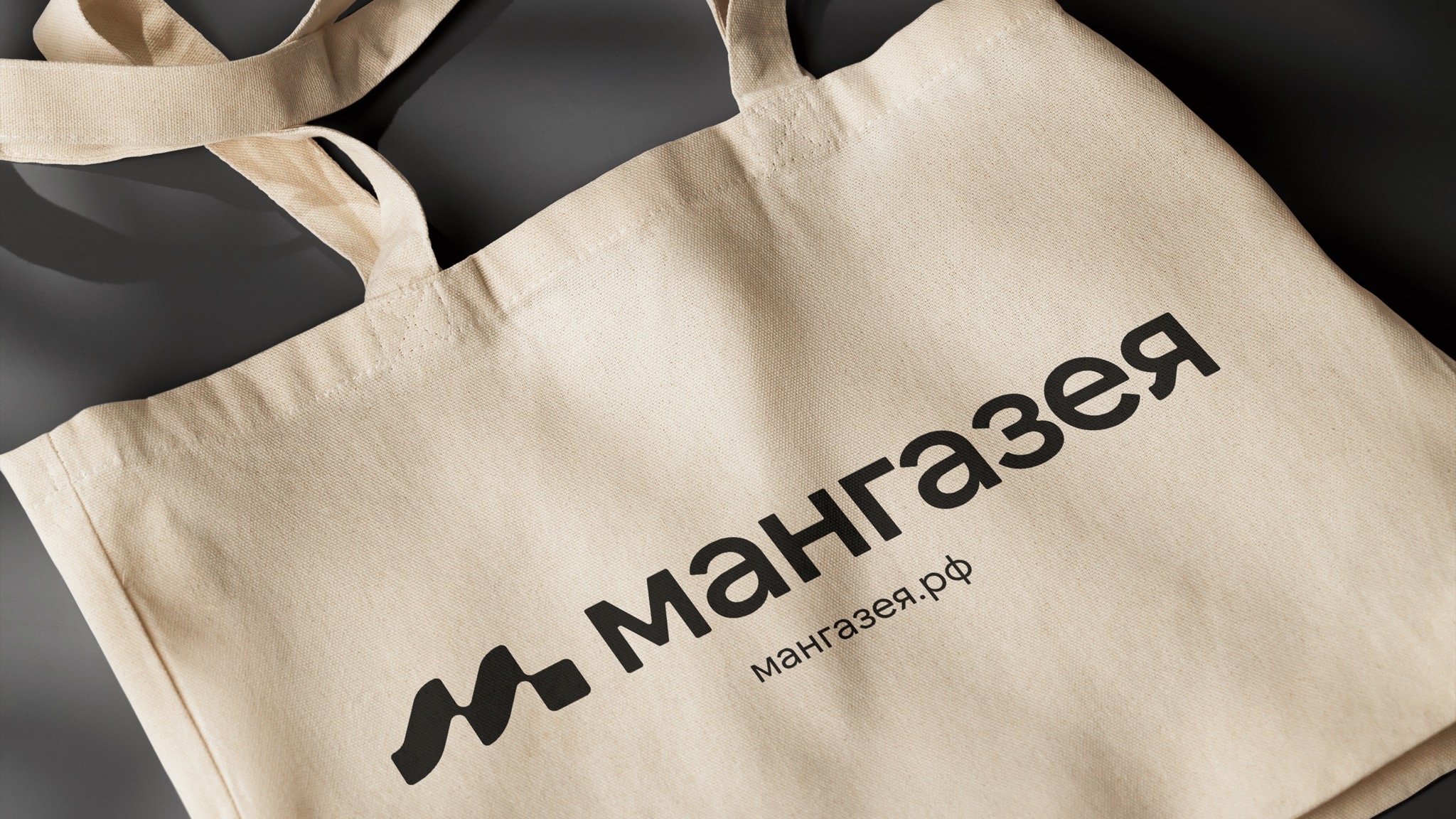
The slogan for the rebranding was Ecosystem of a prosperous life, and the logo combined the first letter of the name with system elements. Different shades of green were used for different segments of real estate, as one of the client's requirements was that projects of different classes should have their own identification while maintaining the overall concept.
The corporate identity was based on consistency, with elements resembling honeycombs and quotes reflecting the essence of the brand. The visual design is meticulously crafted, paying attention to even the smallest details. The quotation marks are drawn in a unique style that aligns with the brand name.
Mangazeya Development now has a flexible and systematic identity that supports brand values and works effectively across various communication channels
- Karina Borisenok
- Mikhail Lelikov
- Daria Berkut
- Zoya Sokolova
- Aleksandr Vashchuk
- Ekaterina Chaikina