Brand development for business class residential complex
- Research
- Brand platform
- Naming
- Global positioning slogan
- Brand identity concept
- Brand identity carriers
- Presentation materials
- Communication strategy
- Advertising materials
- Brand book
Research
Touch is a development company implementing residential and commercial real estate projects. Its new project is a business-class residential complex. The company asked us to create a strong and recognizable brand for this residential complex, which will be globally different from competitors in nearby areas
At Opencore, we always start brand building with qualitative research. The results allow us to understand what meanings the brand should convey, why and how it should look like.
This project was no exception. Searching for answers we conducted the series of in-depth interviews with the target audience and drew up portraits of brands for targeted consumers, studied the nearest competitors and their projects, integrated the features of our residential complex, which then would help the project to stand out in a highly competitive market.
Communication with the audience
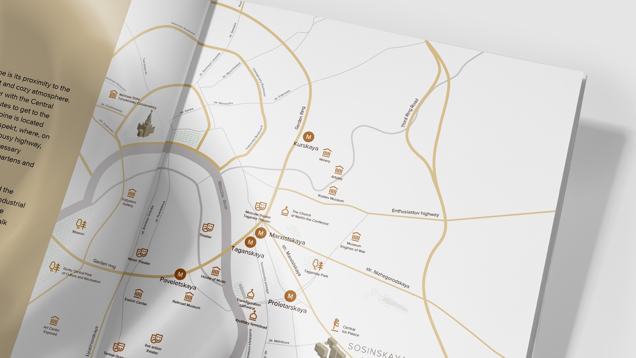
One of the important research’s results was the formation of a clear request of the target audience and the brand's response: “A cozy, chamber business-class residential complex with good transport accessibility and location near the center — a balance of aesthetics, functionality, safety, and comfort.”
We chose harmony and balance as a metaphor of the brand, because this project is a perfect combination of aesthetics, functionality, safety and comfort. Perhaps this is the case when the brand metaphor literally suggested itself during the development process.
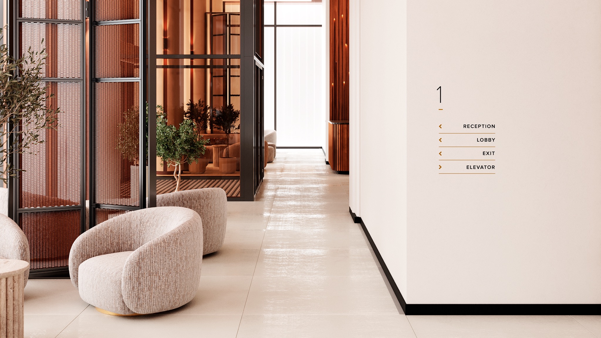
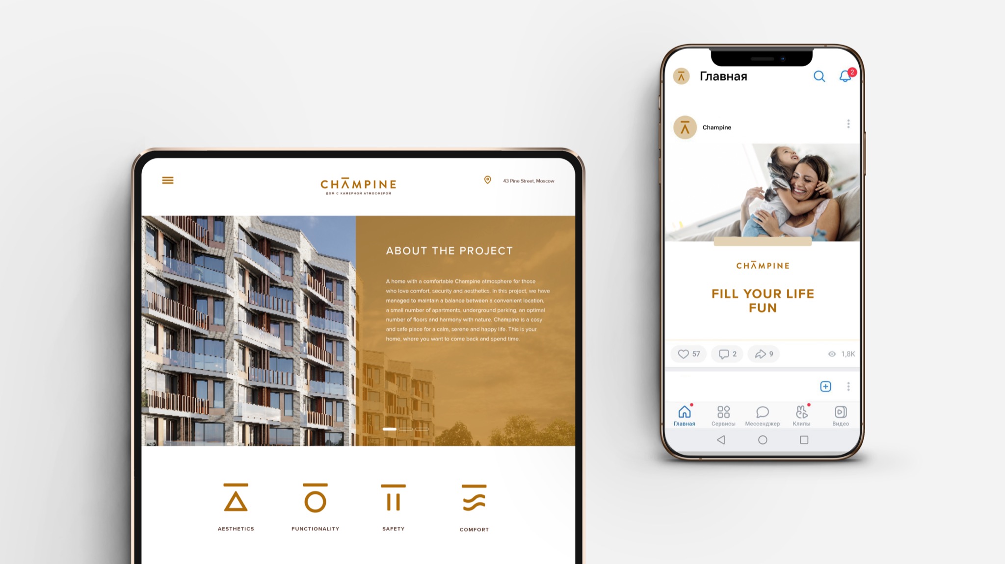
We chose light, calm visual style with free space between elements and simple lines without sharp corners to communicate with the target audience. A warm range of complex shades and a composition with low dynamics convey a state of intimacy and calm in the middle of a big city. There is a feeling of a higher-class LCD, approaching the premium segment in terms of level.
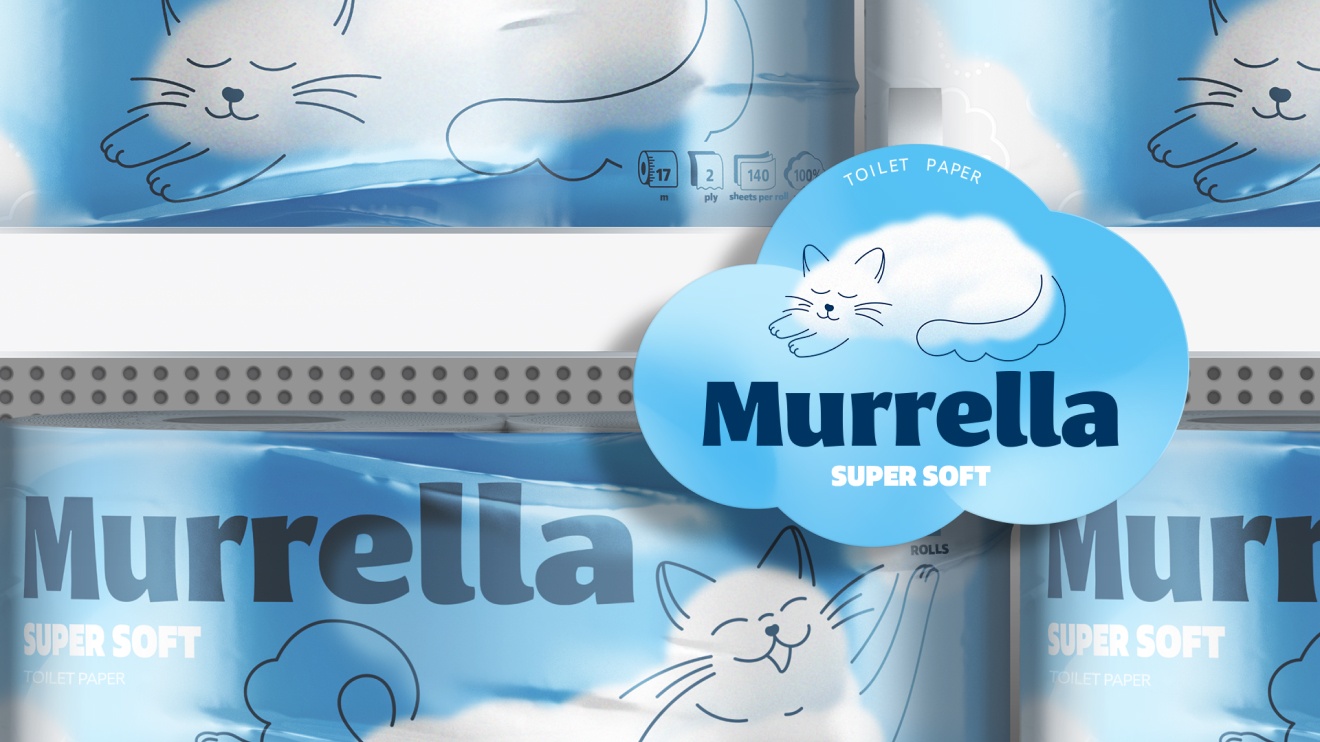
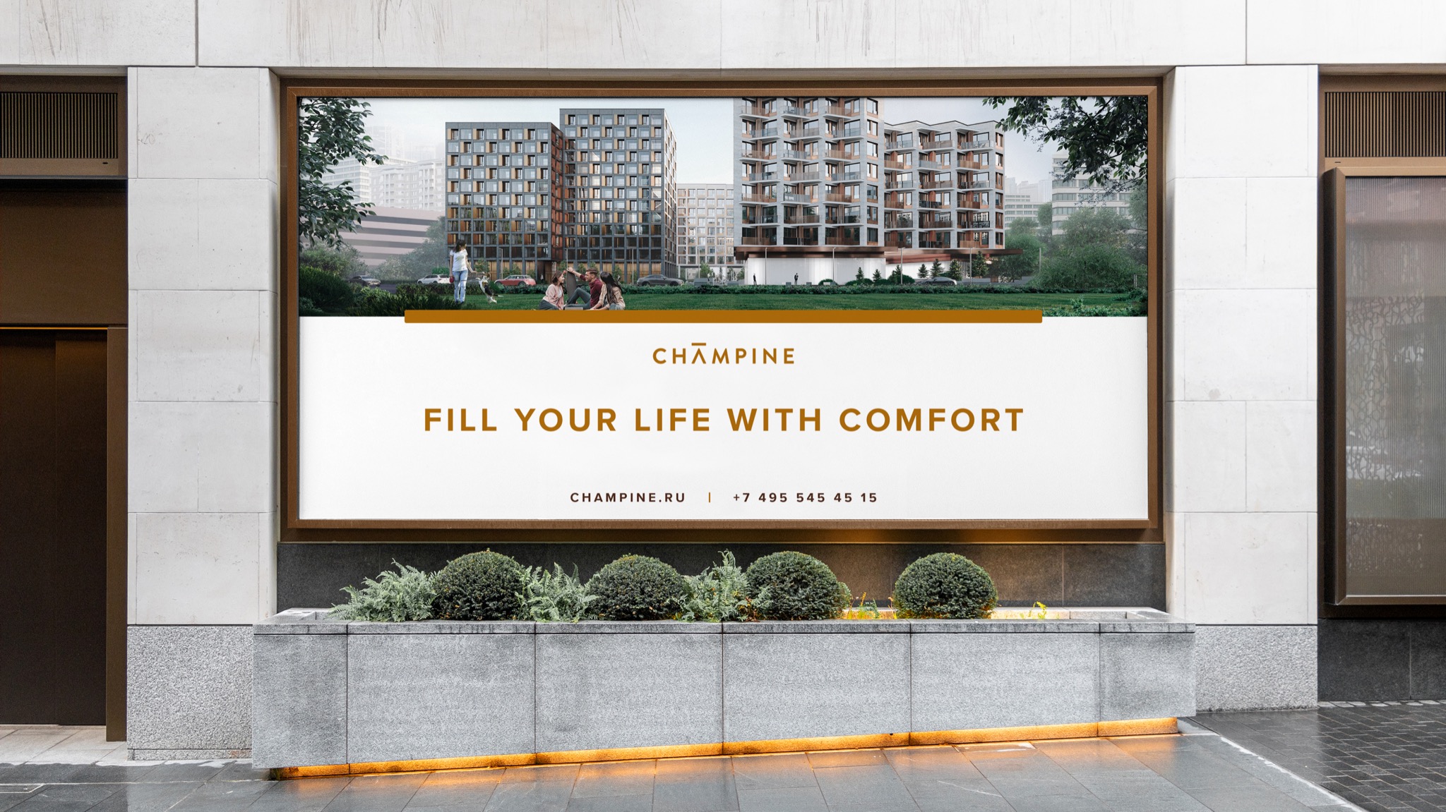
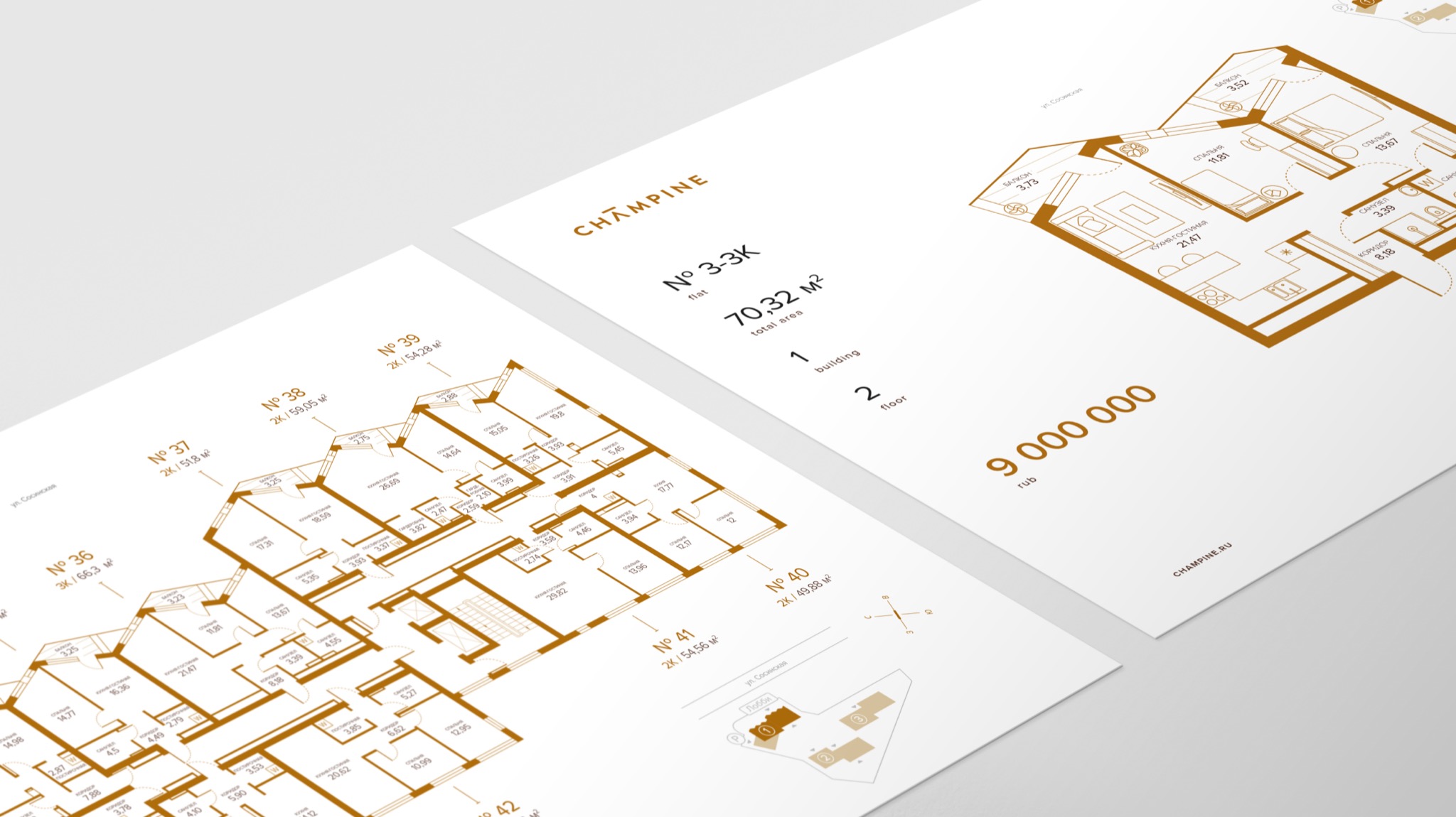
For the name, we were looking for a word consonant with the intonation of the brand and reflecting its character. This is how the residential complex Champine appeared. The name sounds soft and easy, while its first part refers to the intimacy of the complex (chamber), and the second — to the location on the Sosinskaya (pine) street.
Realization
For the name, we were looking for a word consonant with the intonation of the brand and reflecting its character. This is how the residential complex Champine appeared. The name sounds soft and easy, while its first part refers to the intimacy of the complex (chamber), and the second — to the location on the Sosinskaya (pine) street.
We rendered the Champine logo using geometric sans-serif. The Roman sans-serif type was softened with rounded corners of the letters. A noble golden-bronze shade was chosen as the main color, which is in harmony with the color of the facades and looks advantageous both on paper and on advertising media.
We raised upwards a horizontal stroke of the letter “A” and it received a special style – it symbolizes balance and associates with home. The perpendicularity of the lines and the clear visual rhythm of the logo look solid and concise.
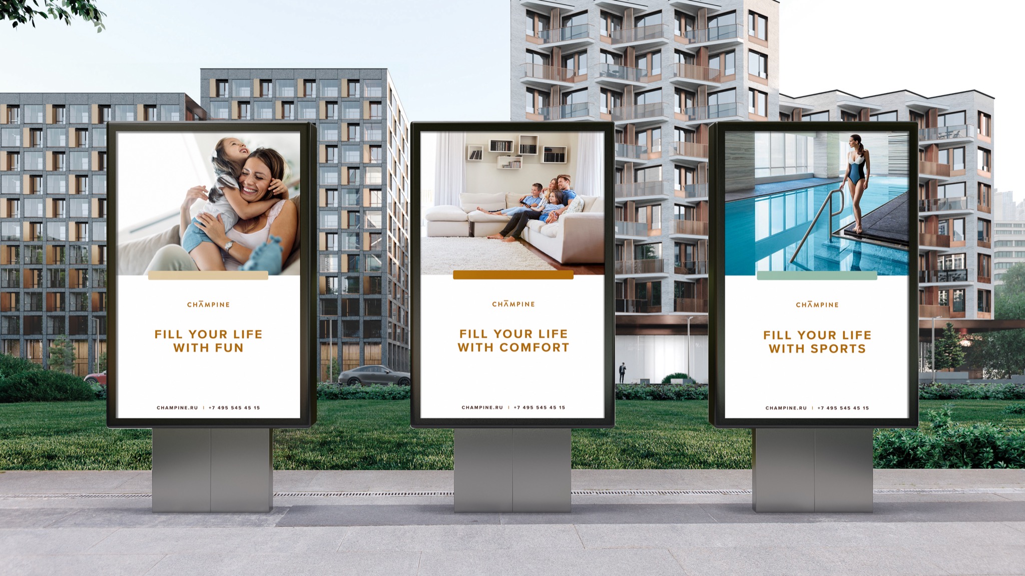
The slogan of global positioning deserves special attention: “Fill life with comfort / functionality / aesthetics”. The dynamic slogan format allows to demonstrate all the benefits depending on the demand of consumers.
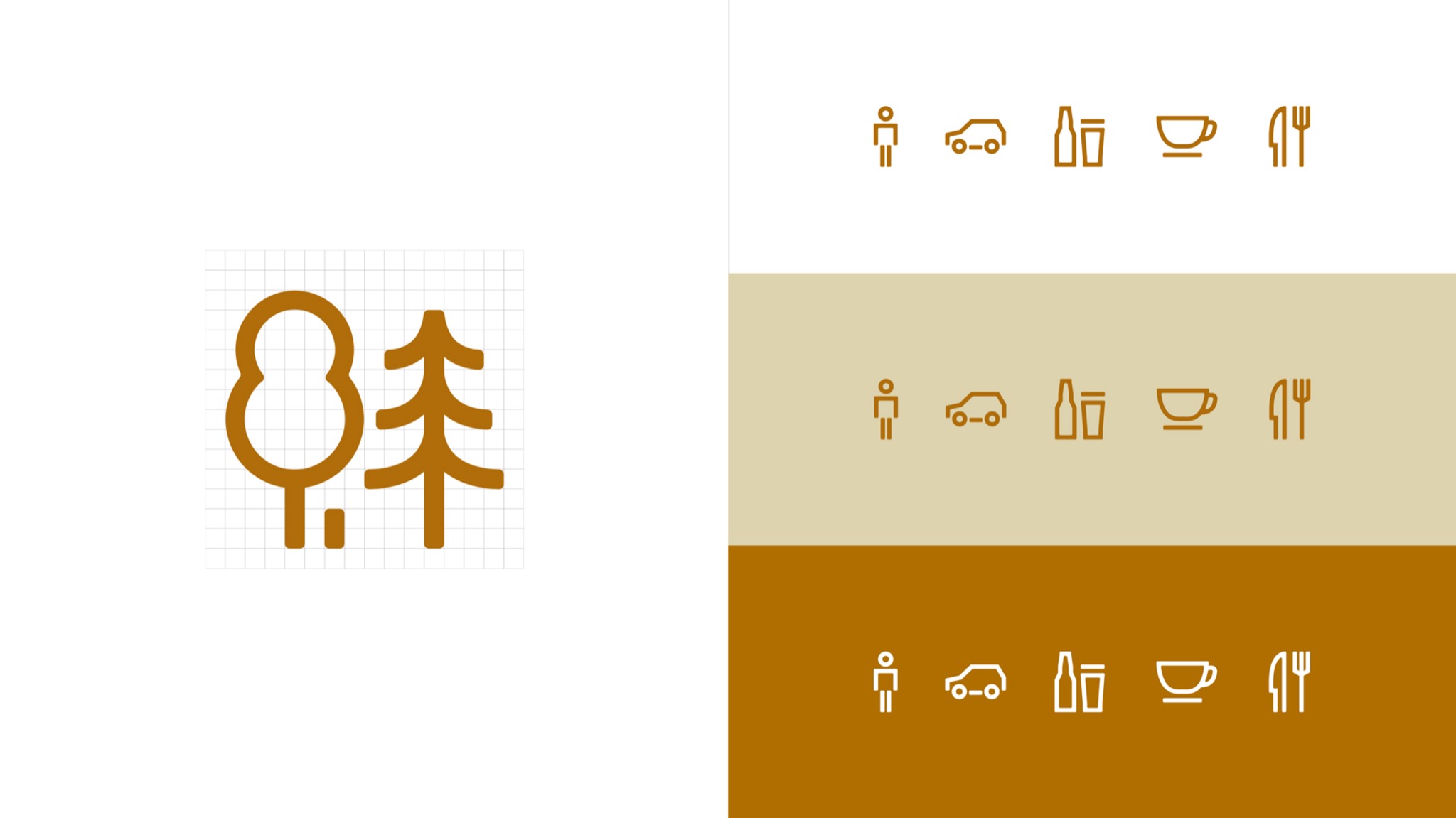
The repeating horizontal line has become a strong identity element of corporate identity. According to it, the brand is easily read from all media: booklets, business cards, signs, and advertising screens. We kept the visual image in the icons, which indicate the key advantages of the brand. The number of icons can be easily supplemented with new elements, if necessary.
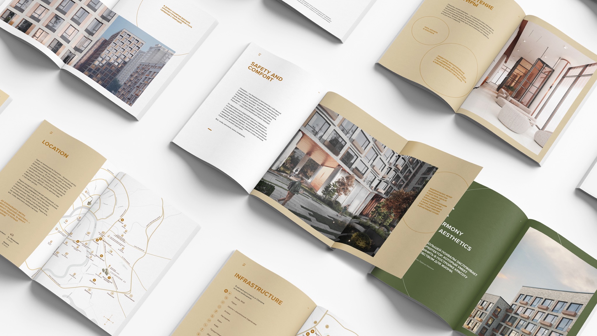
The brand strategy and corporate identity rules were packaged into a native brand-book, so that every Touch employee or contractor would be able to understand what the Champine brand is about and how to work with it correctly.
Managing a brand is not something ephemeral. It is a complex mix of images, ideas and theses about the company, which we can place in the minds of potential customers
- Karina Borisenok
- Mikhail Lelikov
- Denis Basevich
- Viktoria Putilina
- Evgeniy Yan
- Ulyana Kabaeva
- Alexey Kudasov
- Danuta Lobachenya