Updating visual communications for the agroholding company
- Brand identity concept
- Brand identity carriers
- Guideline
Research
RBPI Group, a large agricultural holding that specializes in animal husbandry and crop production, contacted us to develop a corporate identity in a short amount of time. The project was implemented in cooperation between the agencies N:OW and Opencore.
During the initial stage, we conducted in-depth interviews with key representatives of the company, including department heads and top managers. The department heads are specialists from Russia, and many of the top managers are hereditary farmers originally from Denmark.
We considered the combination of Russian and Danish corporate cultures and gathered information on the ideal production of pork and cereals. The interlocutors described an ideal business as having sunny weather, fresh greenery, innovative technologies, and happy employees who enjoy their work. These views have influenced the brand's concept, which emphasizes the harmony of nature and technology with a focus on green and steel shades.
Brand metaphor and logo
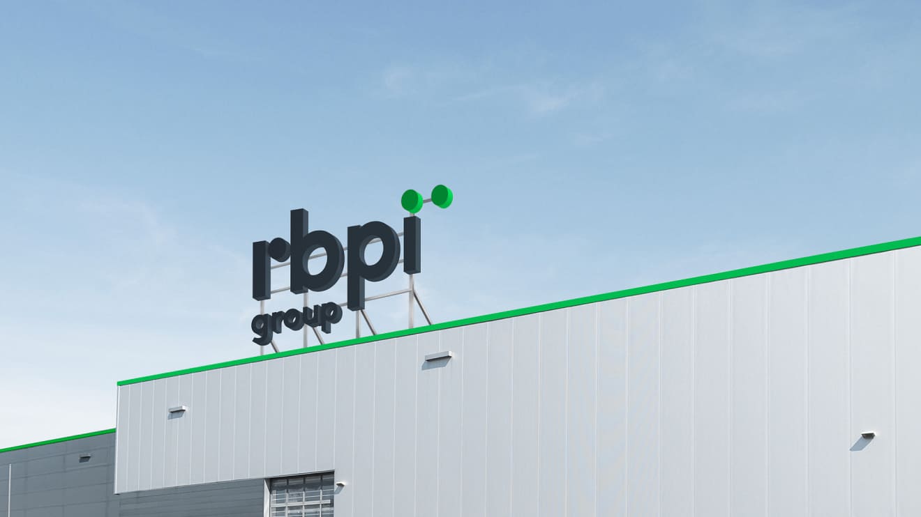
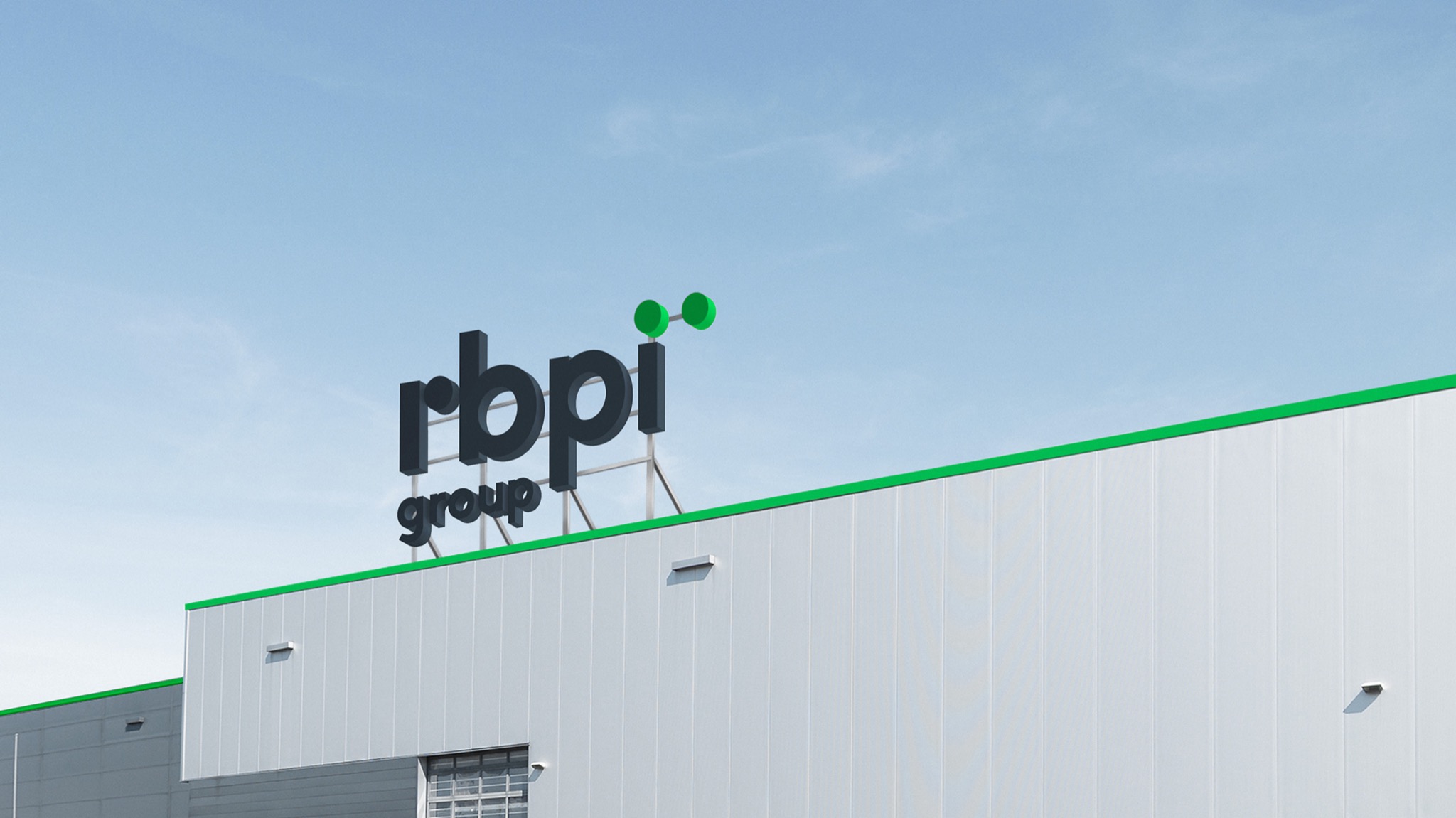
The central brand metaphor made RBPI Group a Mercedes in the agro-industrial sector, representing leadership, innovation, and high-quality products. The brand's main values are efficiency, safety, responsibility, and environmental friendliness.
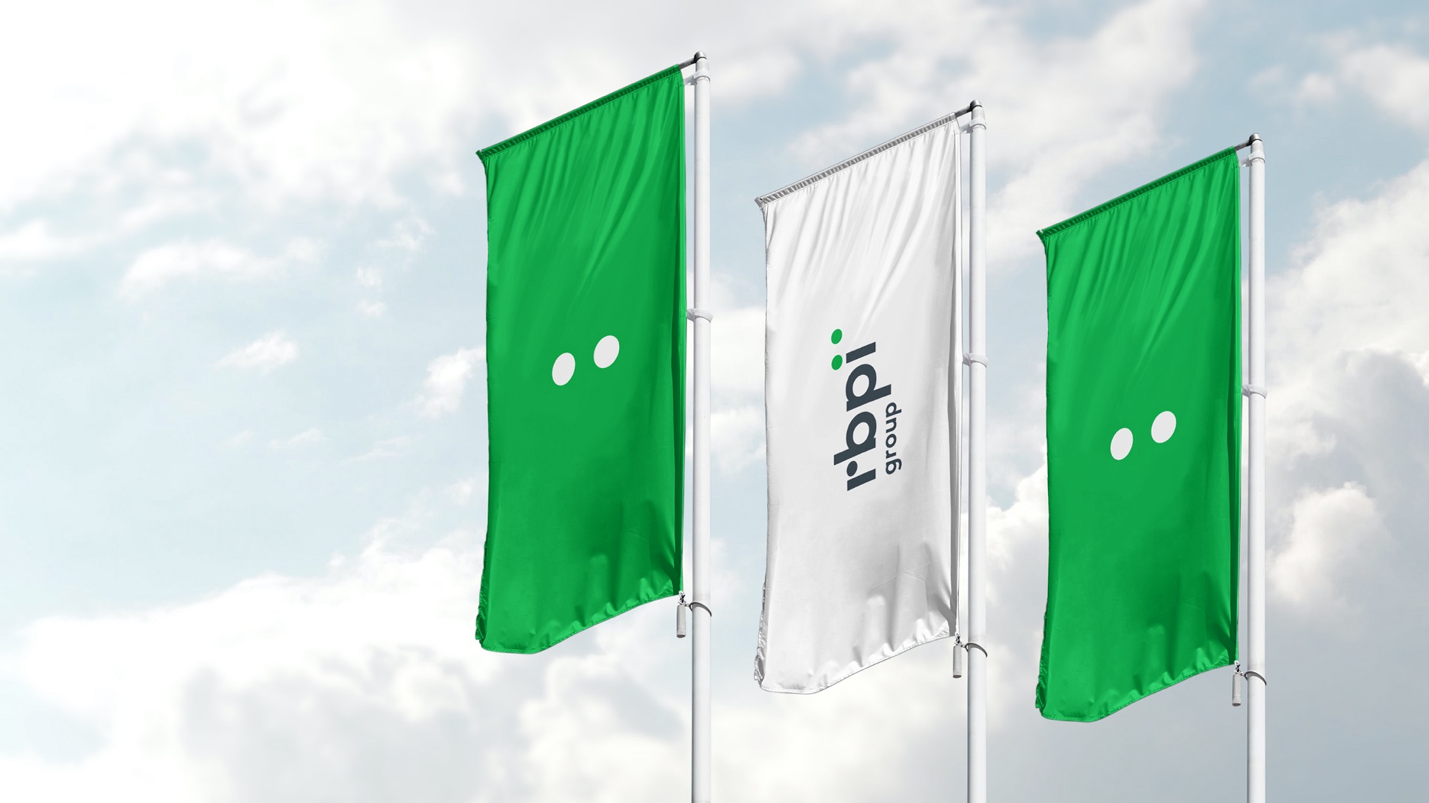
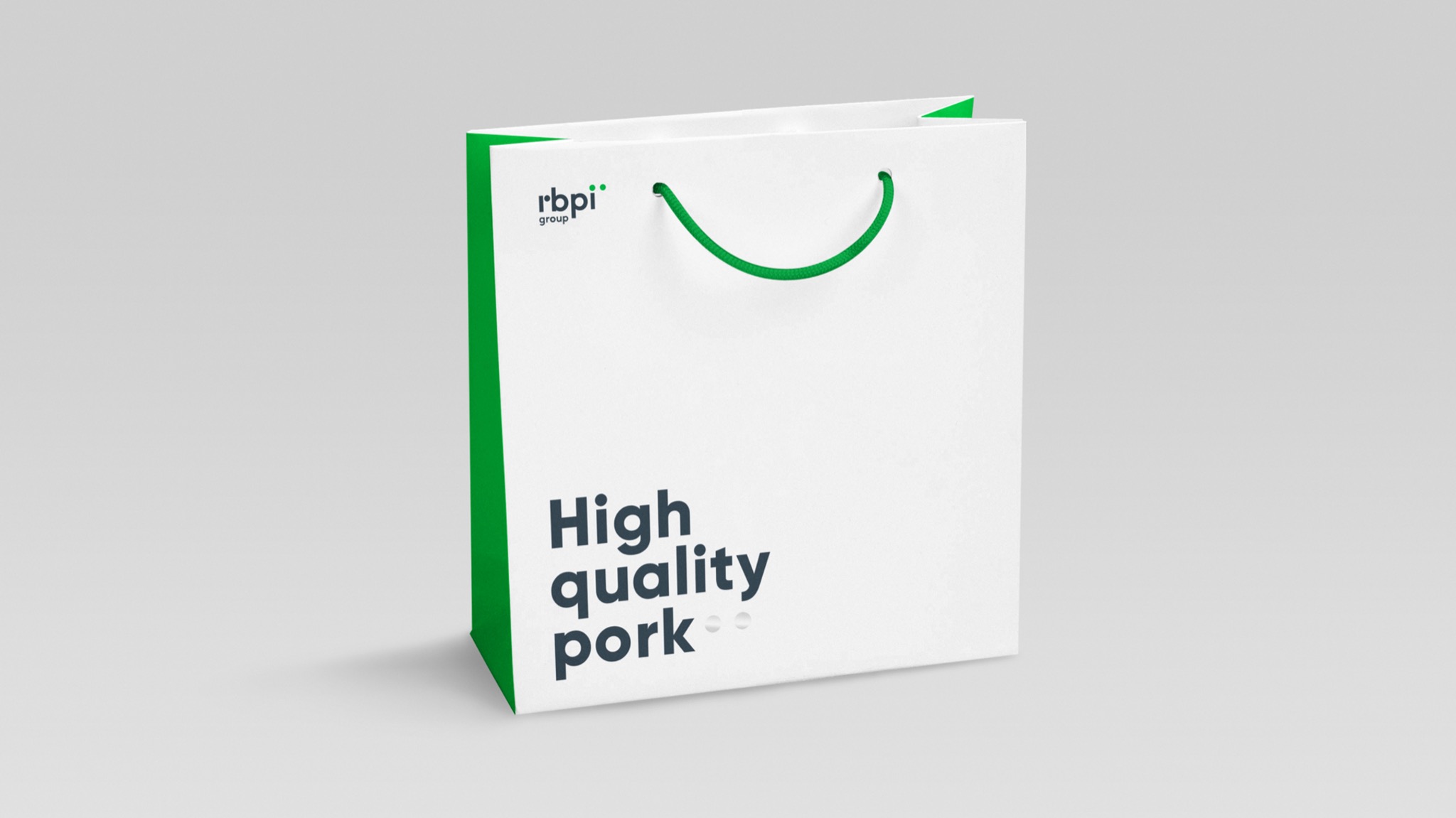
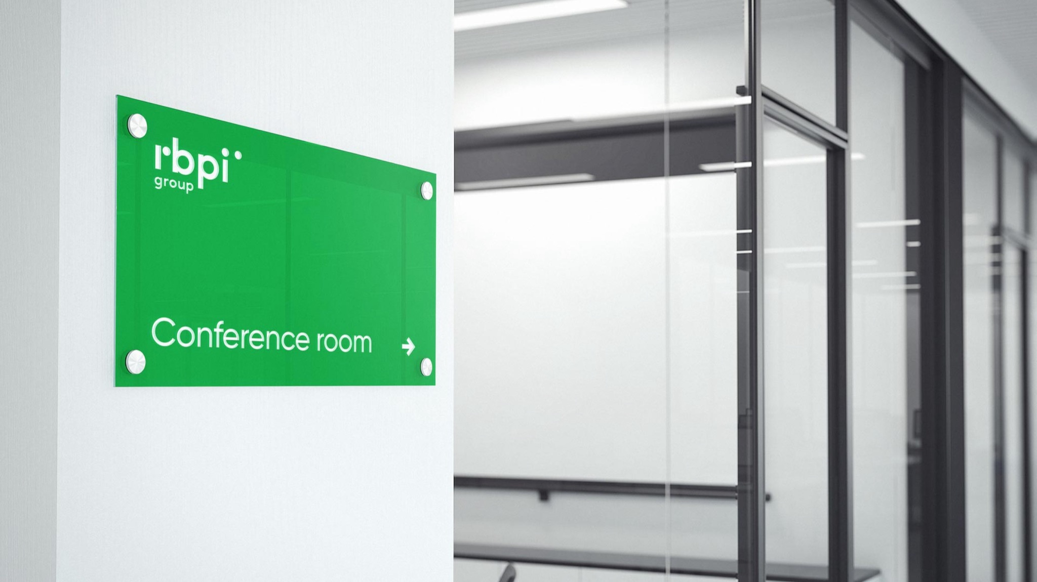
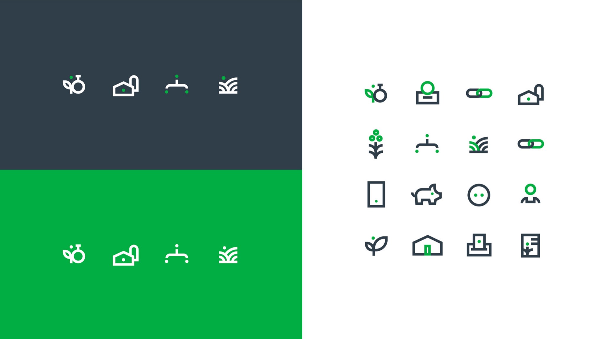
Visual communications include logo design, corporate identity media, and digital format adaptation. RBPI Group's primary focus is on pig reproduction, rearing, and fattening. The brand concept centers around these animals, with a logo featuring concise typography and an index symbol resembling a piglet. This element is used both as part of the logo and separately to enhance brand awareness.
Design
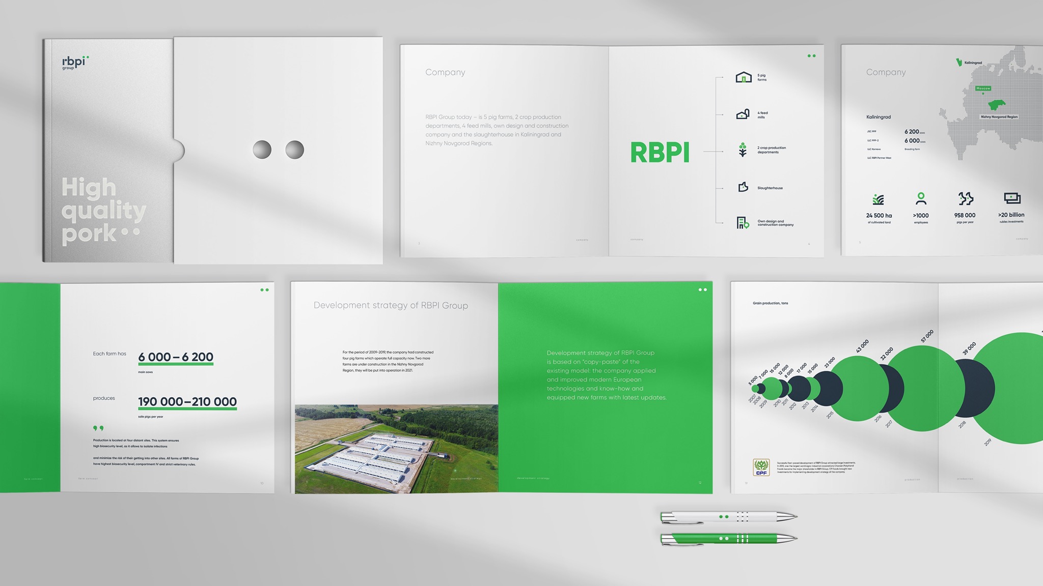
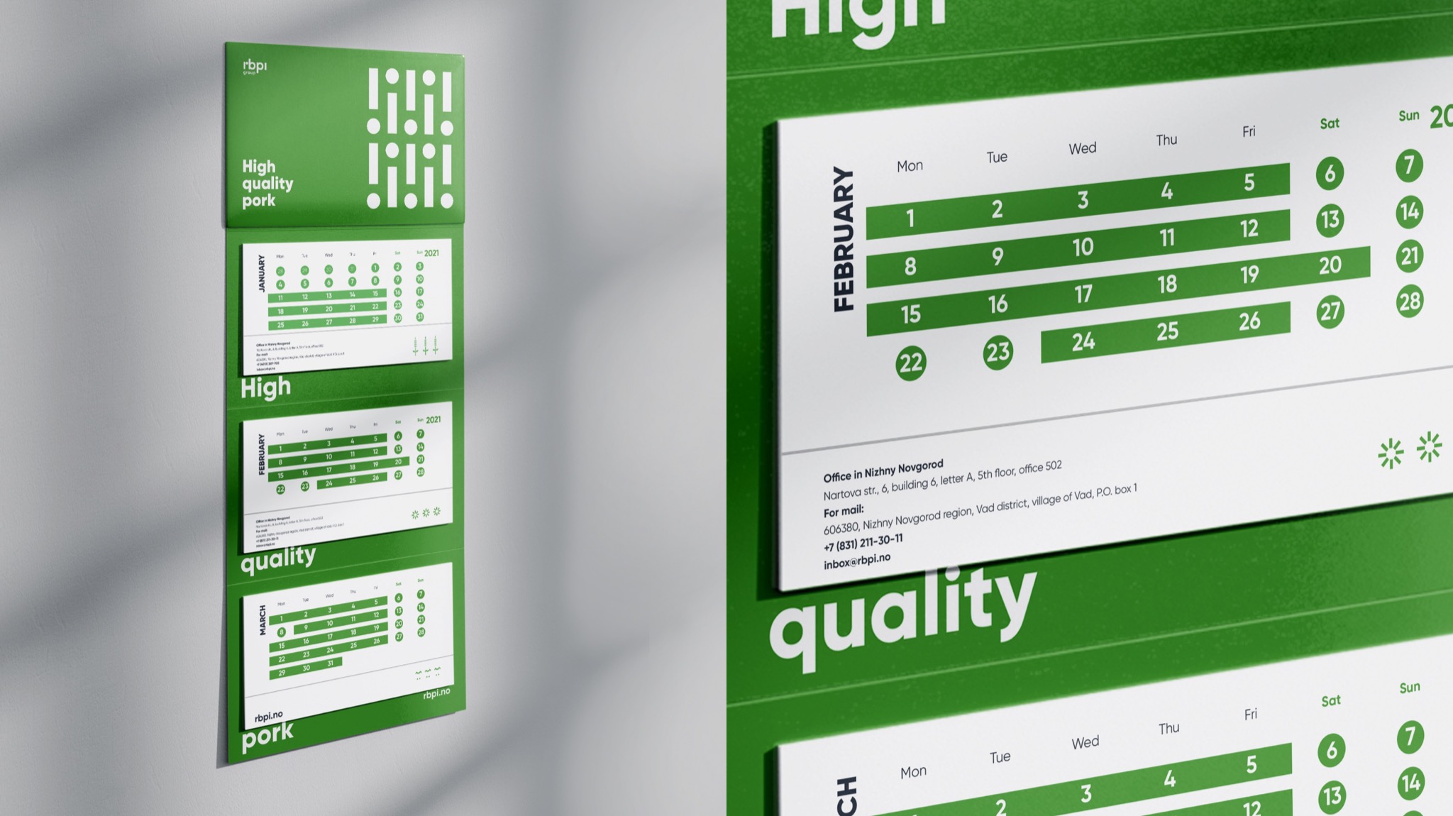
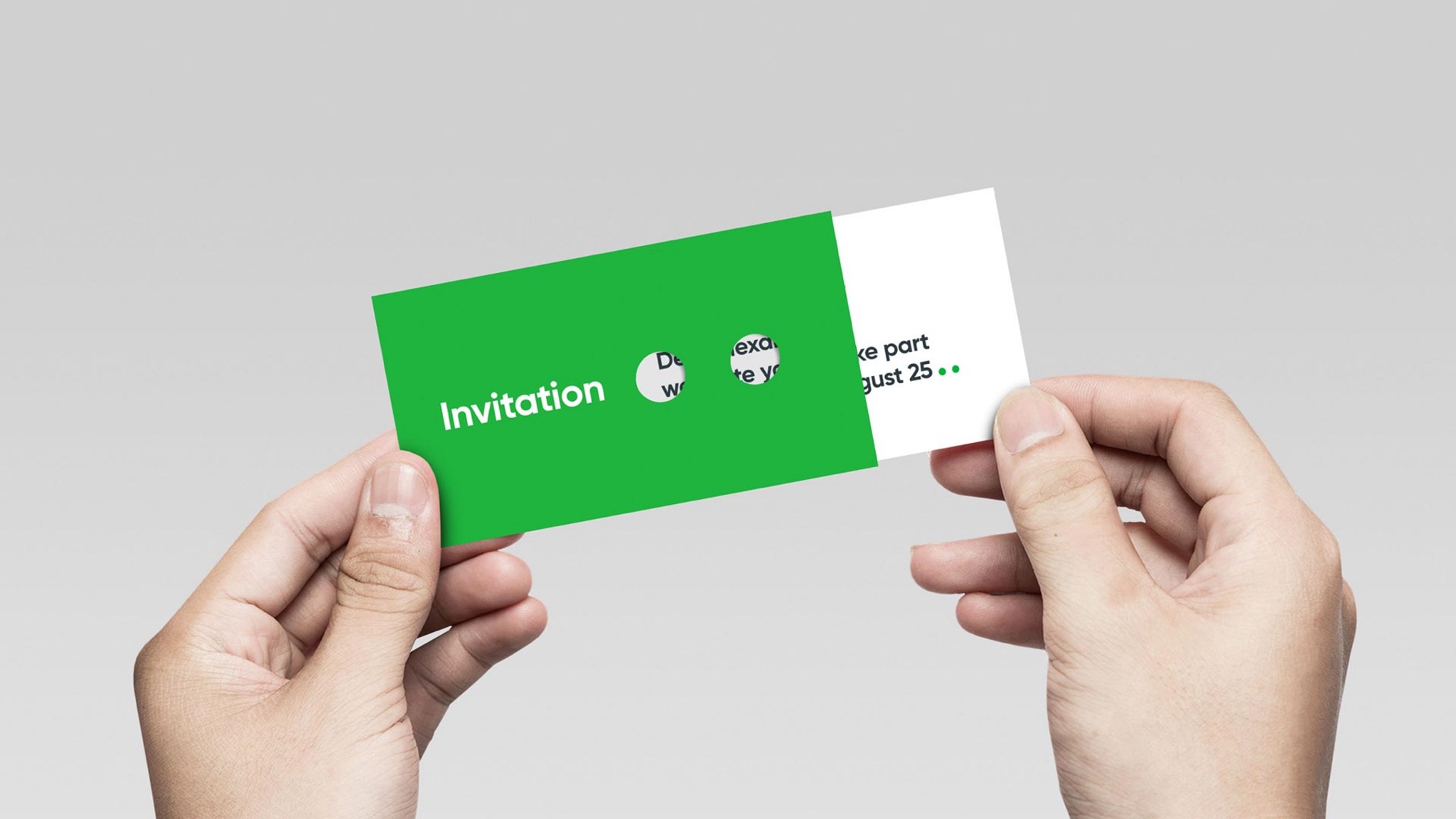
The corporate palette includes green and metallic gray colors that reflect the essence of the business. The design system applies the visual concept to all elements, from paper media to digital products.
An interesting addition is the minimalistic pattern, which incorporates RBPI Group's key meanings: simple lines, clear structure, pure colors as a sign of the company's efficiency and innovative technologies, and circles and stripes as an image of people working in green fields. The pattern's vertical orientation symbolizes the company's responsibility and reliability. The pattern can be used in different colors and sizes within the project framework.
Despite the tight deadlines, we accurately expressed the key brand ideas and created a thoughtful and recognizable corporate identity. We created a cool, minimalistic design without using boring photo collages or stock images. Based on the pattern, logo, and slogan, we have created a design with a unique modular grid that highlights the brand's concept while maintaining its functionality.
The client was satisfied with the result, which accurately reflected the company's values and meanings
- Igor Demidov
- Anastasia Gladkaya
- Mikhail Lelikov
- Karina Borisenok
- Denis Basevich
- Viktoria Putilina
- Dmitry Pavlov