Developing visual communications for pharmaceutical companies

- Brand identity concept
- Brand identity carriers
- Guideline
Research
Octapharma-Pharmimex, a new pharmaceutical company founded for their upcoming blood plasma drug production plant in Russia, has requested a new logo. The logo should reflect the identity of both alliance companies and product features while maintaining a serious and reliable image of the company.
We formed the key attributes of the Octapharma-Pharmimex brand based on in-depth interviews with representatives of the customer's team. These attributes include the development of unique technologies, global quality standards, social significance, and patient health. We also collected detailed data on drugs, their functions, and production specifics, as well as market and development opportunities for the enterprise.
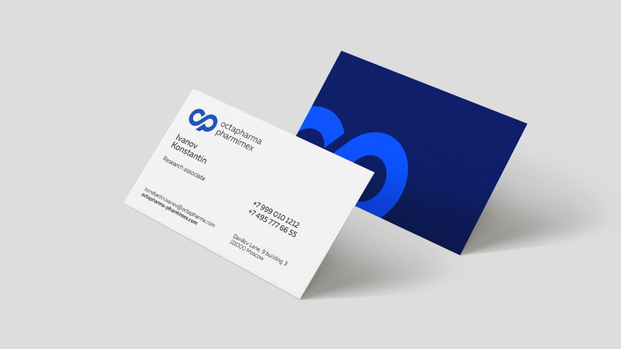
Our work on this project was limited to developing a logo and related documentation on its use.

Logo
We analyzed the interview results and described in detail what the new logo should be. These elements should emphasize the idea of an alliance between two companies and convey the essence of the product - the missing elements of blood, like the elements of a constructor or a puzzle. The visual style should be modern and technological, but not overly innovative. Innovation in its purest form is a risk that is unacceptable for this category. The corporate identity should reflect the combination of several elements. We identified the most frequently used words in the respondents' answers and used them to collect the key brand semantics.
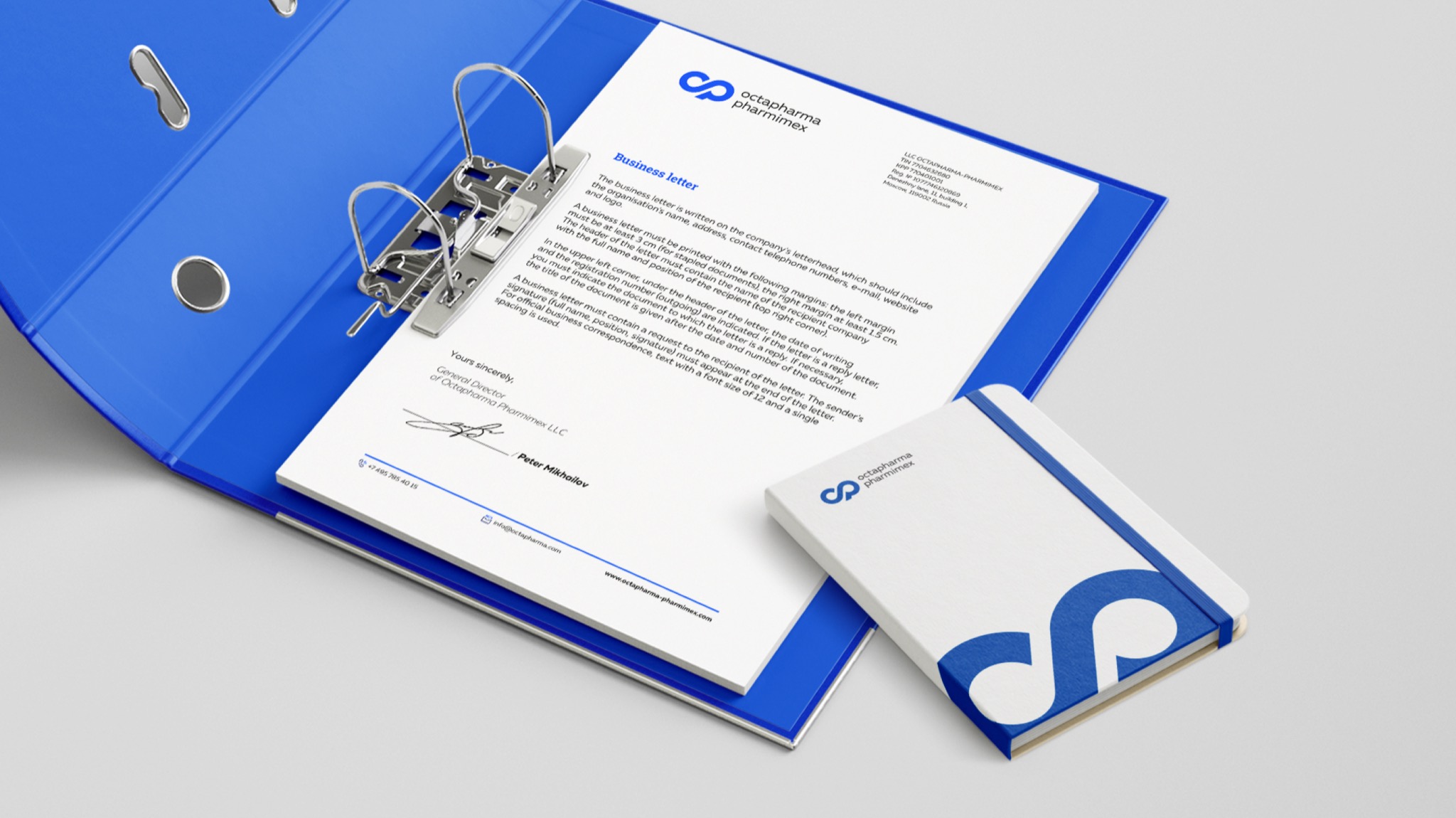
Based on this, we compiled a precise technical specification that describes exactly what the Octapharma-Pharmimex corporate identity should be. We developed a logo that combines the letters O and P to symbolize the alliance of the two companies. The symbol of infinity represents the desire for the longest possible life expectancy. The visual style is modern and technological, emphasizing stability and reliability. The system of geometric shapes reflects high production standards.
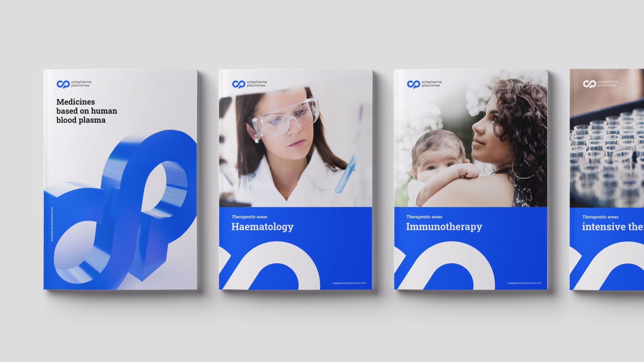

Brand identity
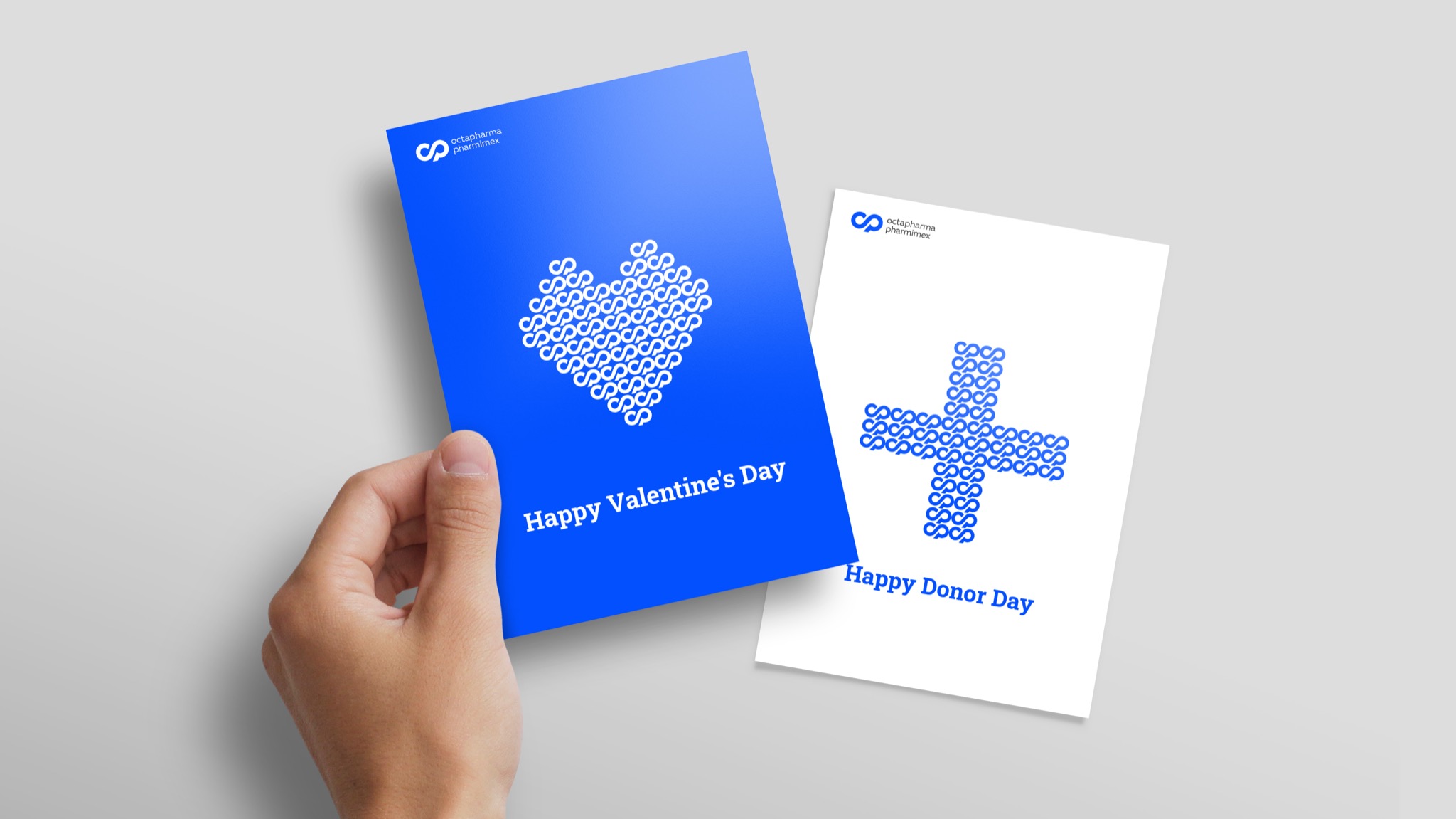
The style's main elements, including pictographs and illustrations, were designed with the rigor of geometric shapes and a combination of basic and accent colors in mind. We packaged all developed elements and corporate identity media in a guideline to ensure the customer can use them without mistakes while maintaining a consistent brand image.
This project demonstrates the significance of considering every aspect of corporate identity to effectively communicate the brand's key messages to customers

- Mikhail Lelikov
- Karina Borisenok
- Daria Berkut
- Denis Basevich
- Viktoria Putilina
- Dmitriy Pavlov
- Sergey Kuleshev
- Ulyana Kabaeva