Brand development for an audit and consulting company
- Research
- Brand platform
- Title
- Global positioning slogan
- Brand identity concept
- Brand identity carriers
- Brand book
Research
The representative office of Baker Tilly in the CIS, one of the top 10 global consulting companies, turned to us to develop its unique brand. Working with N:OW in 2022, at a time of mass withdrawal of international companies from the Russian market, we had the opportunity to create a strong brand that would stand out from the competition and avoid future mistakes.
The rebranding process included determining the company's place in the market, searching for unique selling propositions, and developing a brand strategy. We conducted executive interviews, analyzed competitors, and used the Psychea behavioral model to segment the target audience. The data we gathered from the decision-makers and the analysis of the big four competitors allowed us to look at the situation in the consulting market from different perspectives.
It was also important for us to understand - what exactly is Beterra's superpower? After all, this is not their first crisis and not their first transformation experience. How does the team manage to go through such difficult periods in history so steadily? We began to explore the value codes of the consulting market in general, and Beterra's cultural code in particular, to understand what makes them unique. The discovery for us was that Beterra is one of the few companies with a mature culture. It is important for team leaders to cultivate and support their own values, and not the other way around - trying to impose fashionable values to learn from someone else's experience.
Name and slogan
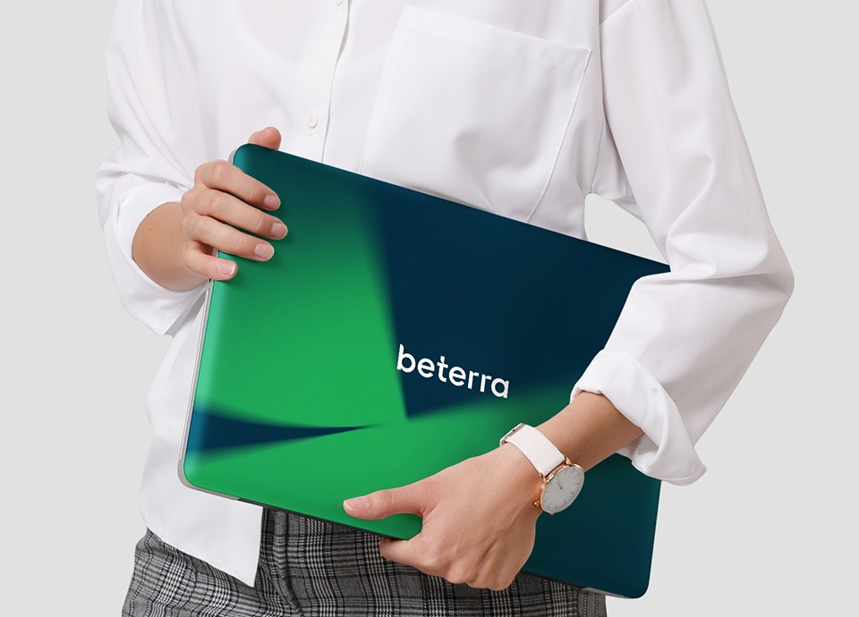
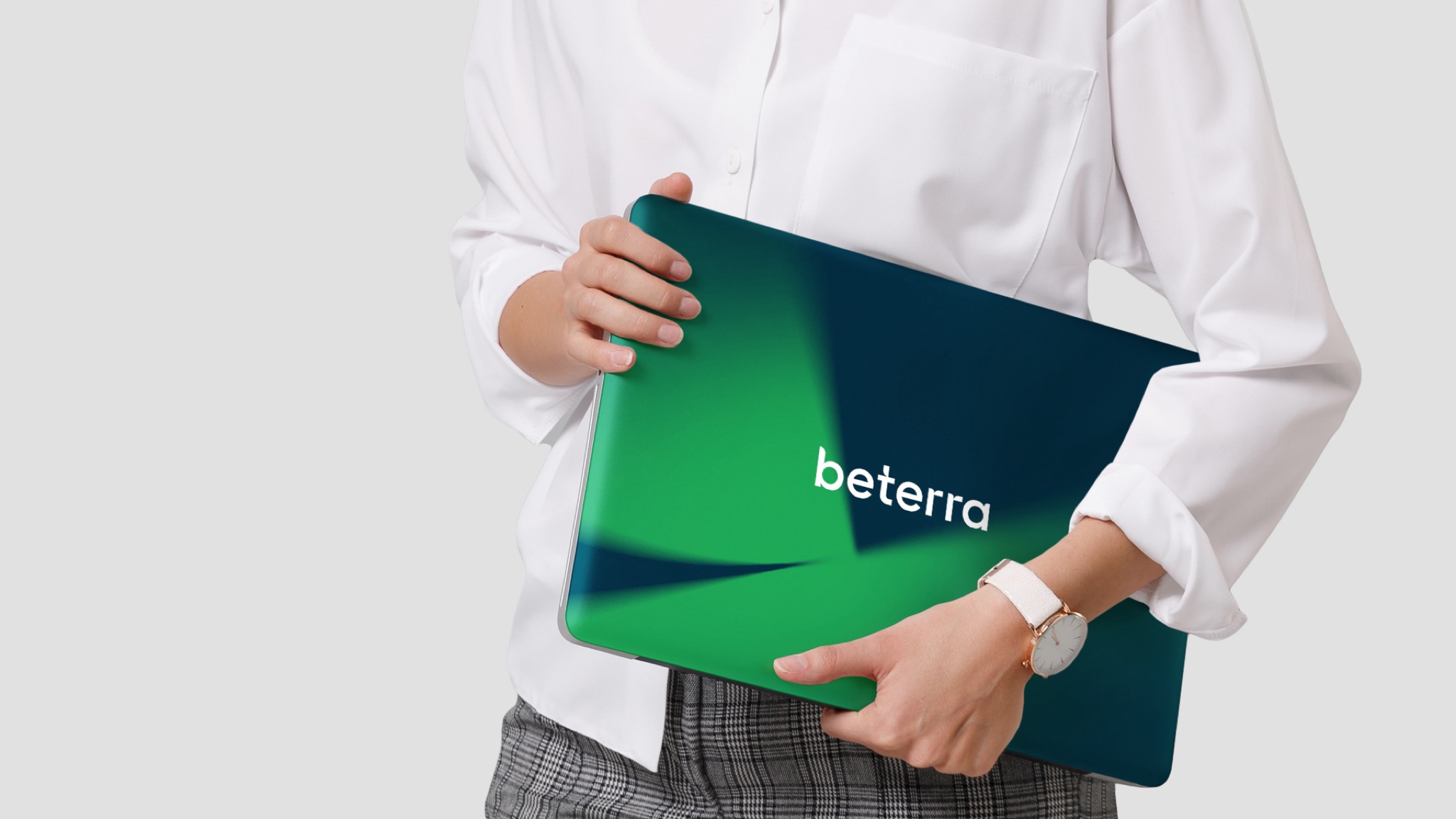
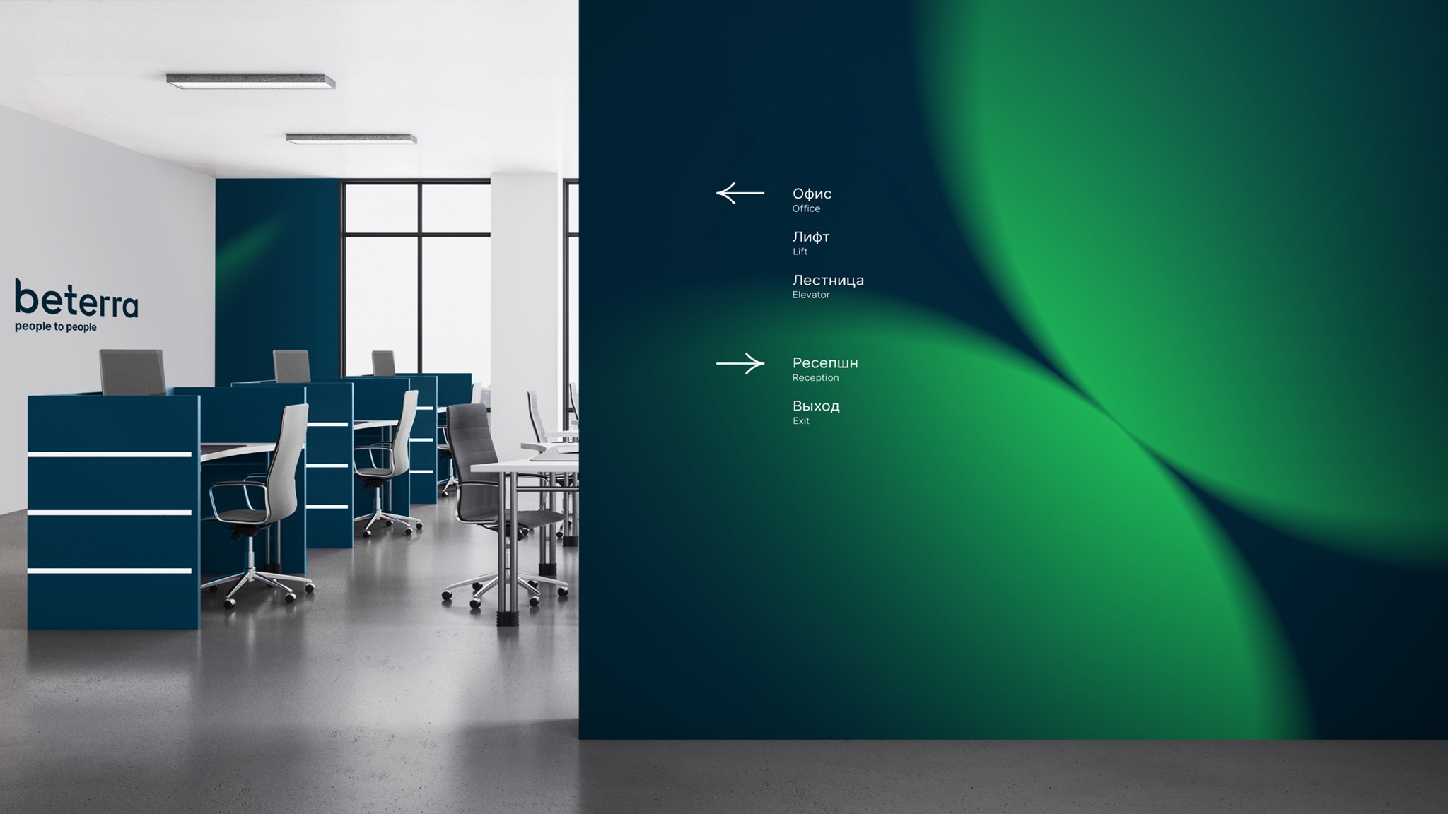
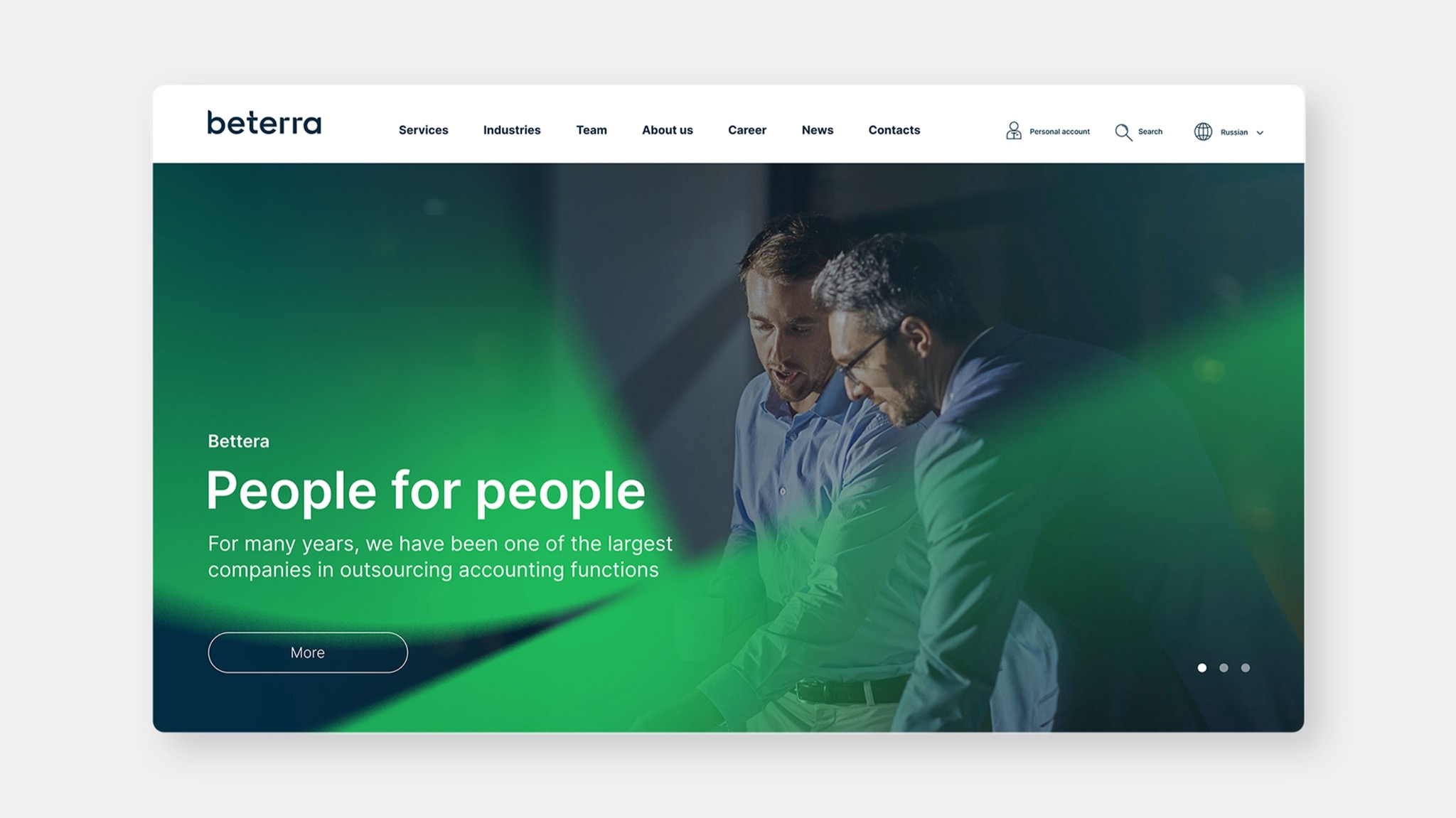
The revealed unique cultural code of Beterra, which includes rationalism and a human approach, served as the basis for positioning the company as an audit and consulting firm with a human face. We developed the name Beterra, a combination of better and terra, as well as the slogan human to human to emphasize the human orientation.
Design
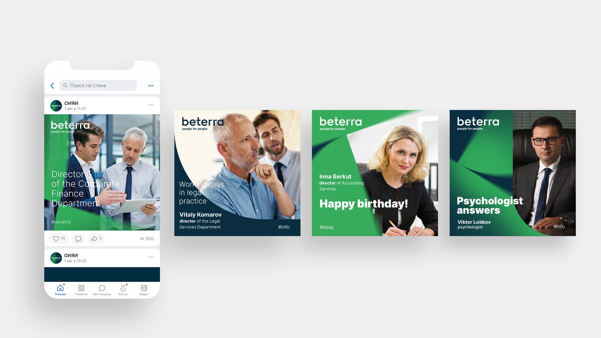
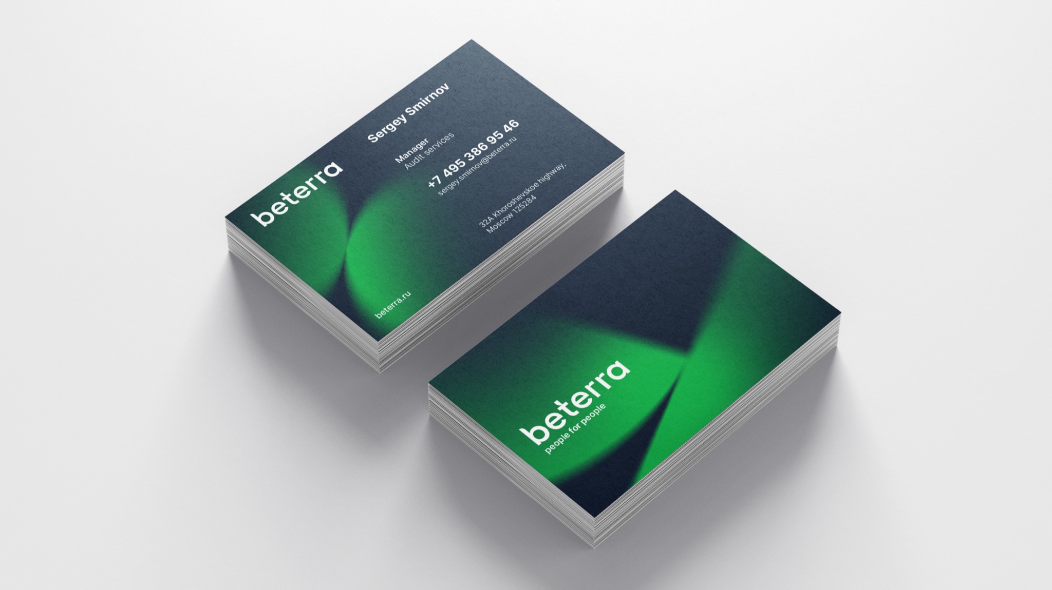
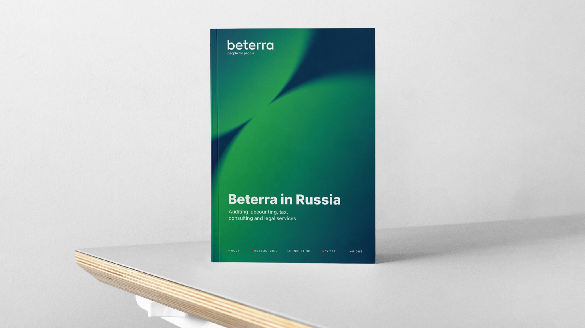
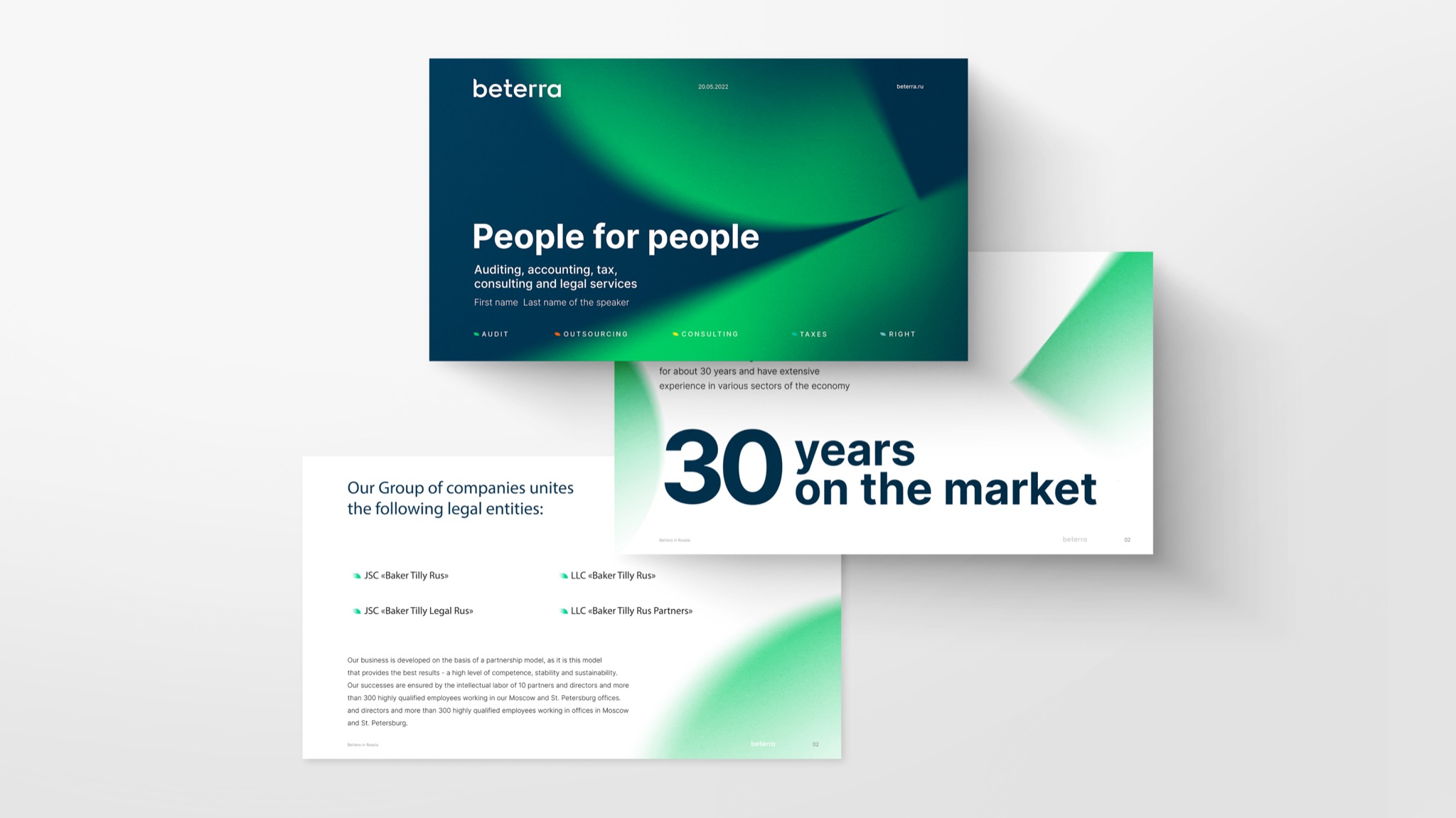
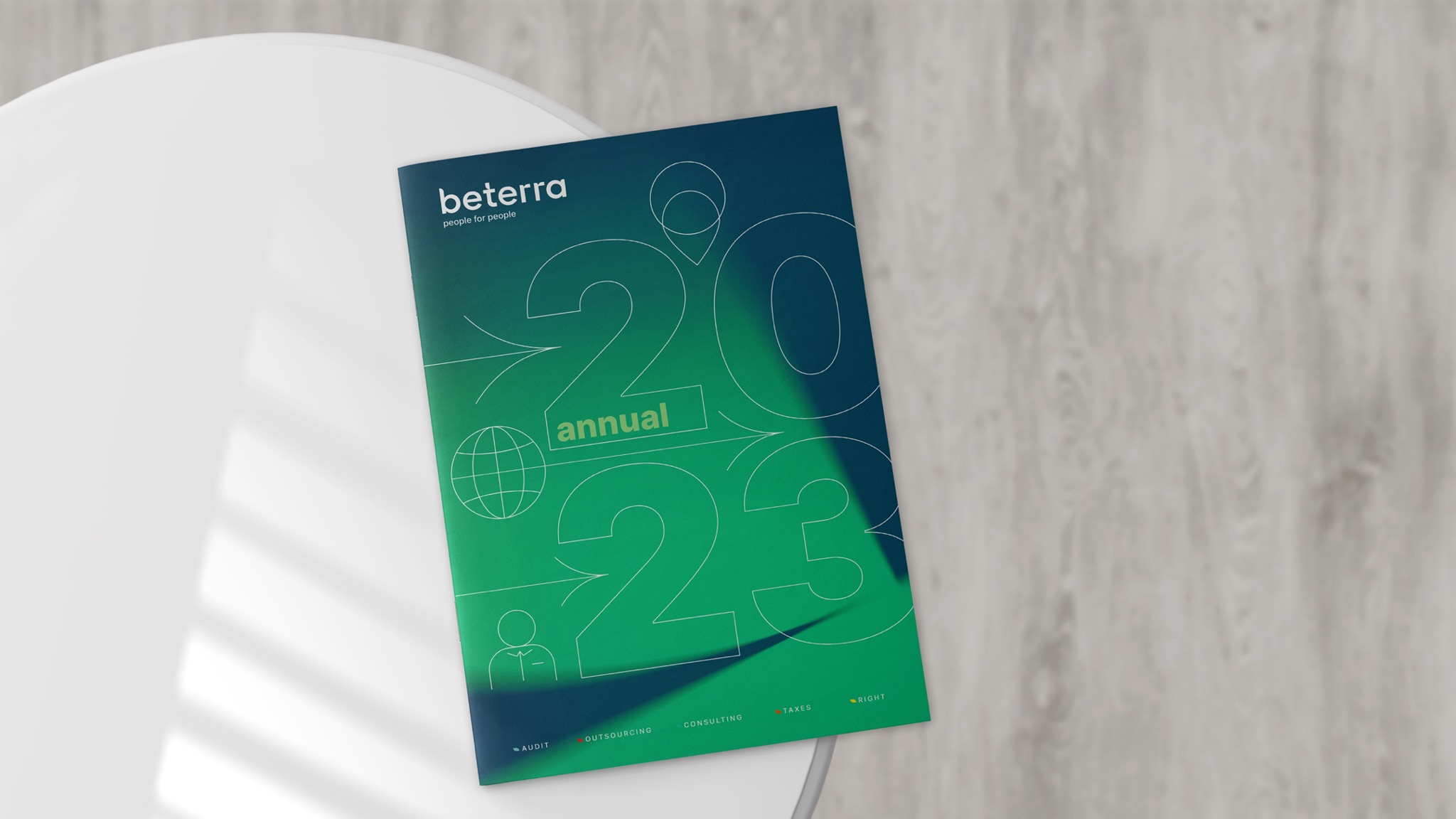
The color palette included shades of green and an achromatic scale, symbolizing freshness and vitality. Geometric shapes in the corporate graphics created the impression of green foliage, drawing attention to the main point. While working on the corporate identity, we found interesting accent elements in the letters T and R, which unobtrusively intertwined associations with the brand positioning. The resulting index signs, combined with the vertical base of the letters T and R, symbolize shoots with leaves, firmly planted in the soil formed by the word Beterra. Three-dimensional pictograms with fine graphics harmonized with the design and drew attention to key points.
As a result, Beterra has gained a recognizable and durable brand that will work effectively in the long run
- Karina Borisenok
- Mikhail Lelikov
- Daria Berkut
- Zoya Sokolova
- Denis Basevich
- Viktoria Putilina
- Evgeniy Yan