Toilet paper brand development

- Research
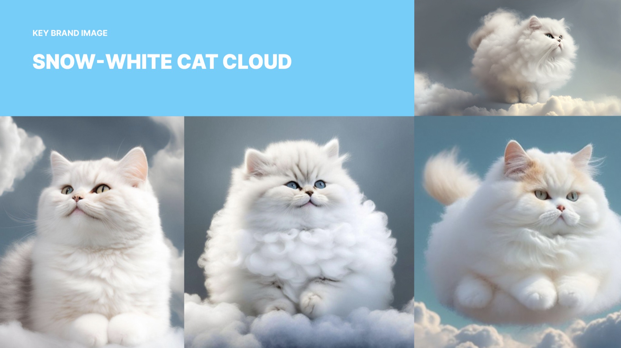
- Key brand idea (metaphor)
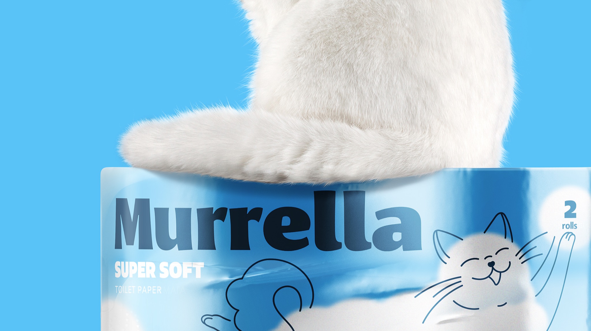
- Brand name
- Packaging design concept
Research
Russian Paper, a company with over 20 years of experience in the market, approached us to develop a new mid-segment brand of toilet paper.
We conducted in-depth interviews with the client’s top management to understand market nuances while simultaneously analyzing 14 different competitors. We paid attention to their visual style and key features. During discussions with the client’s team, we consulted four different consumer groups to gain a better understanding of their preferences. This enabled us to develop a universal product concept: comfortable toilet paper of good quality at a fair price.
Design
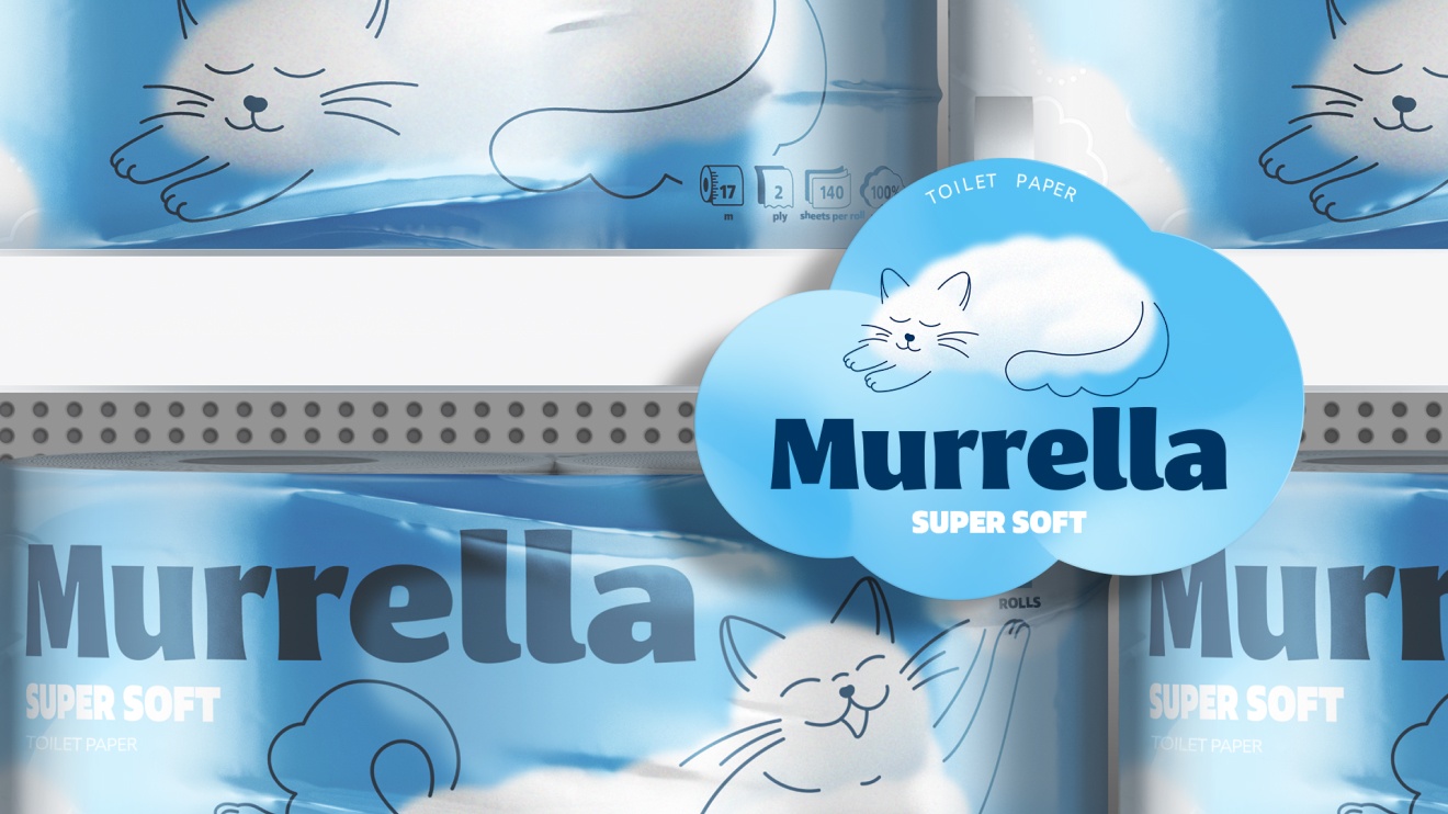
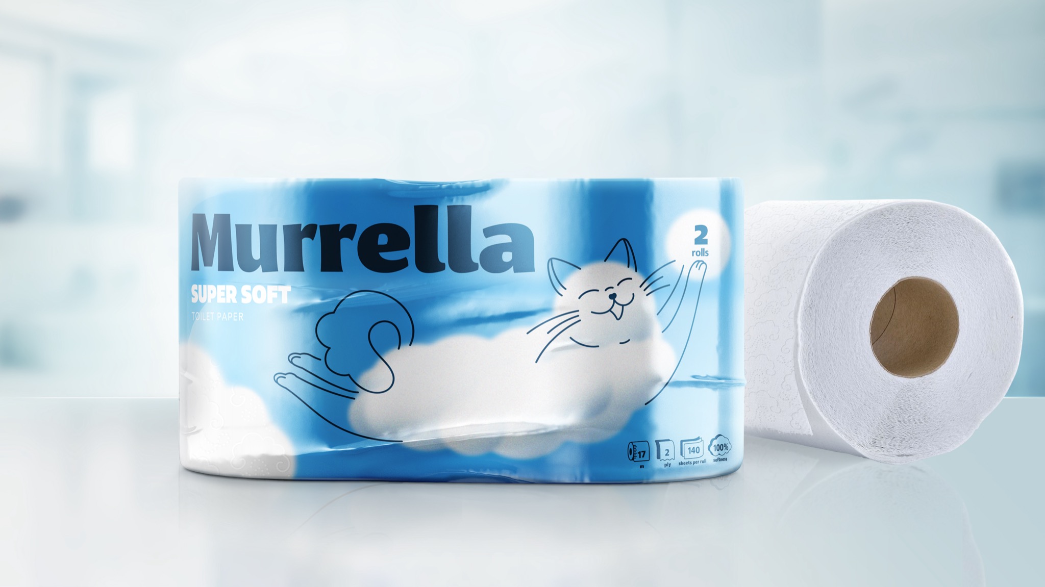
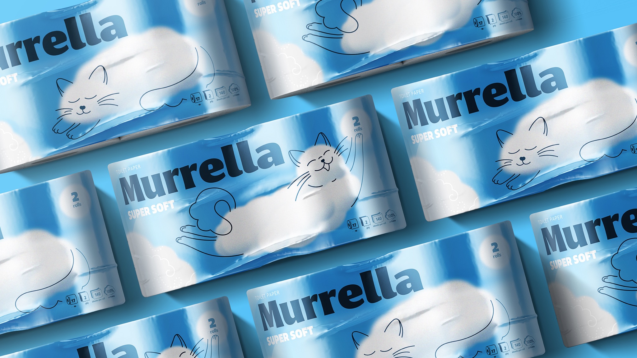
In the product design, we prioritised a natural white colour to symbolise purity and modernity, as well as a balance of strength and softness. The packaging should be simple yet visually appealing, without any unnecessary elements. We considered the colours and design carefully to avoid any associations with chemical processing or the Soviet past. We also avoided elements that may seem too luxurious.
Visual identity and brand name
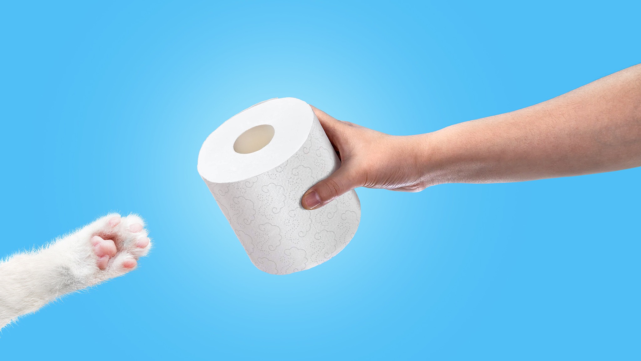
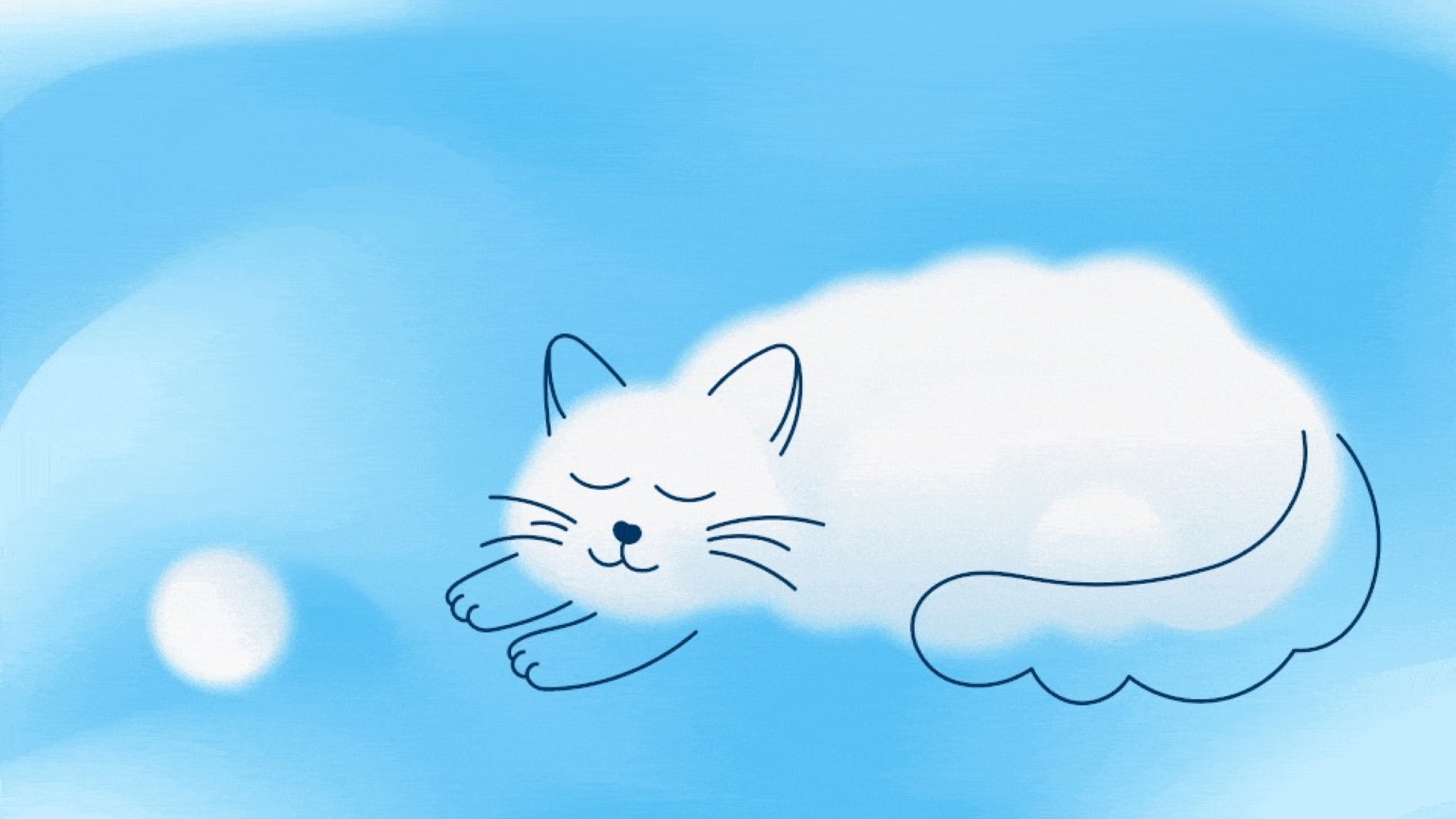
We gathered sufficient information about the preferences of different target audiences, which enabled us to formulate the brief accurately for the development of the brand name and visual identity. For the brand image, we chose a white and fluffy cat resembling a cloud. The cat image reflects the values of the audience and is associated with home and family. It is a simple and understandable image that conveys the idea of universality, tenderness, softness, comfort, and care. The white colour, which is a basic market requirement and an indicator of cleanliness, is the most successful solution for the category. This image was instrumental in creating the brand name Murella, which reflects the key characteristics of the brand. Furthermore, the name Murella has a light and slightly playful connotation, with a strong connection to the chosen key idea.
We created the visual identity using a combination of photographs and graphic illustrations. The fluffy clouds resemble cute kittens, and the color palette includes white and sky-blue colors. The Fact font adds lightness and naivety to the image. The cat image was generated using neural networks, which helped us convey our idea to the client’s team.

We successfully created a vibrant and emotional brand that meets the market's needs and target audience despite budget and timeline constraints
- Karina Borisenok
- Mikhail Lelikov
- Daria Berkut
- Zoya Sokolova
- Denis Basevich
- Viktoria Putilina
- Evgeniy Yan